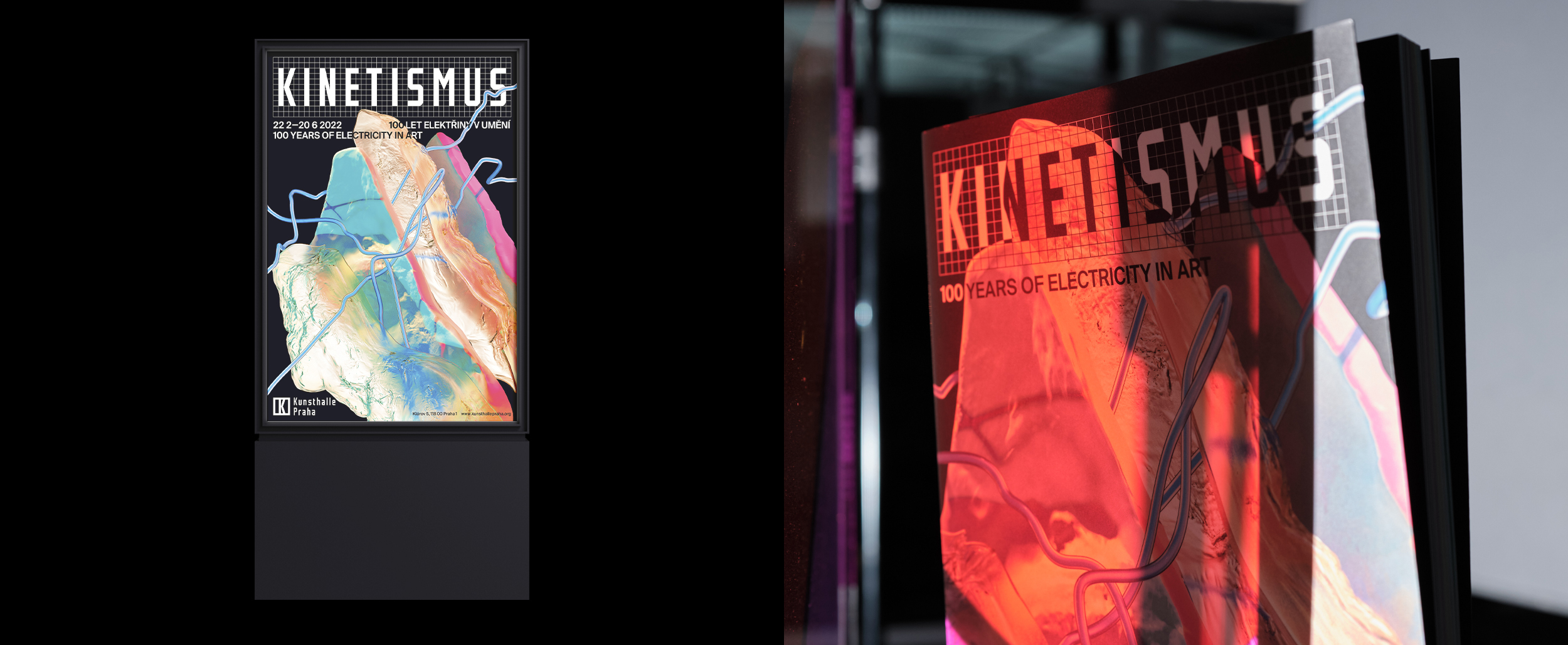
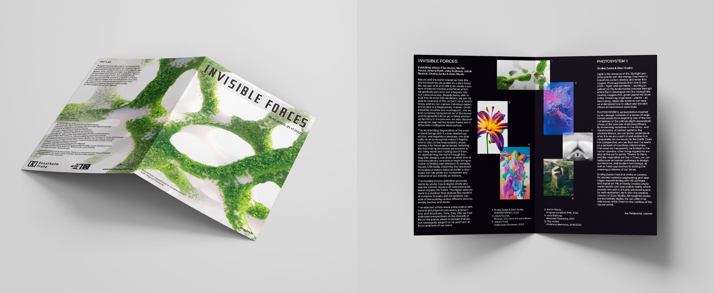
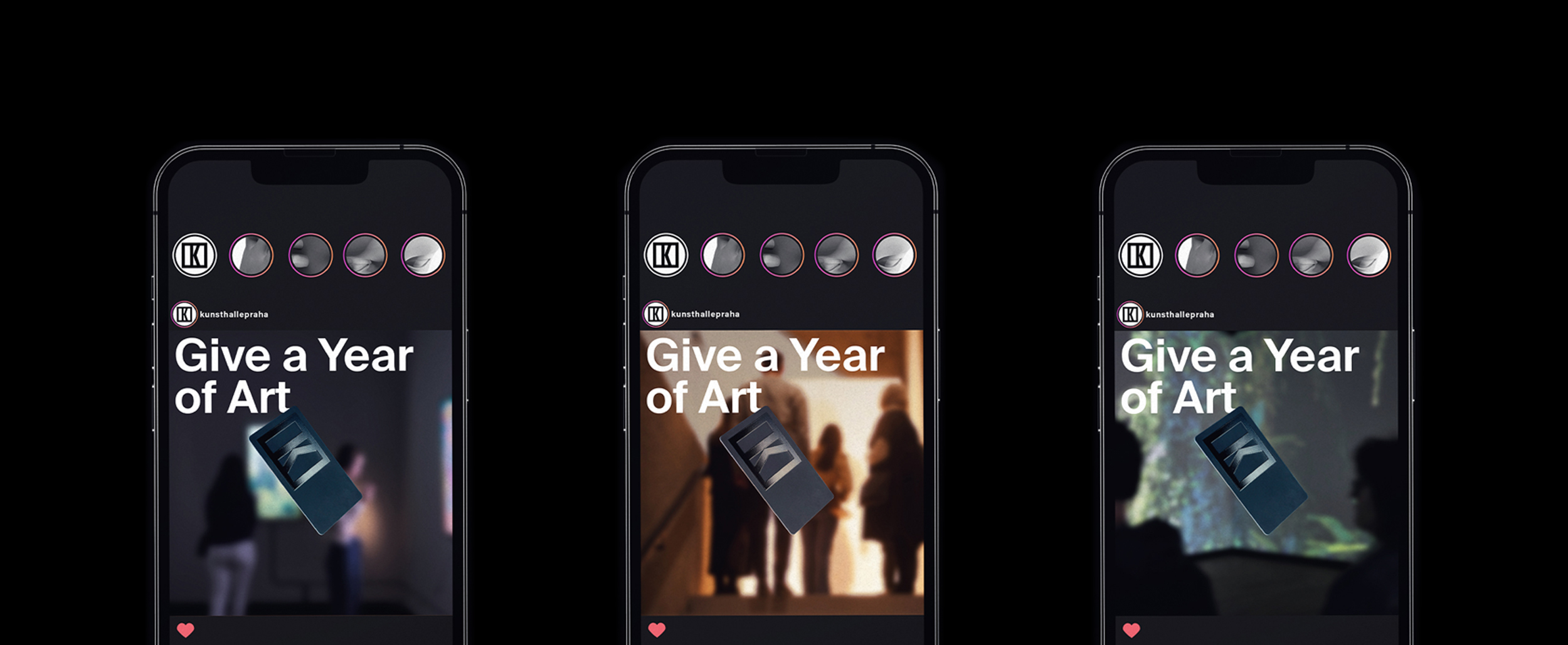
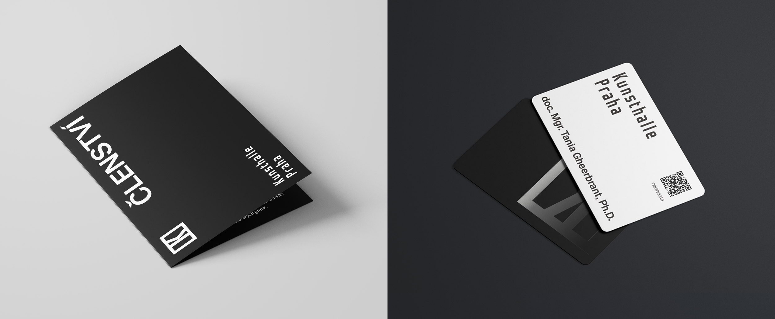
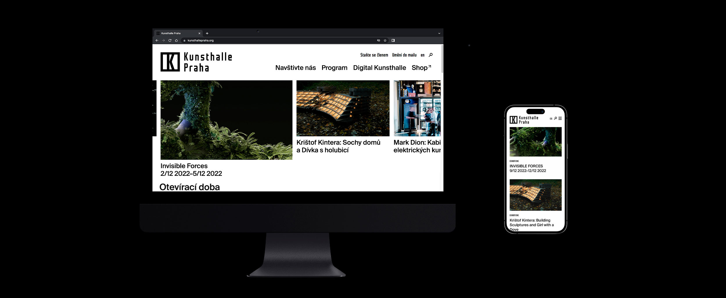
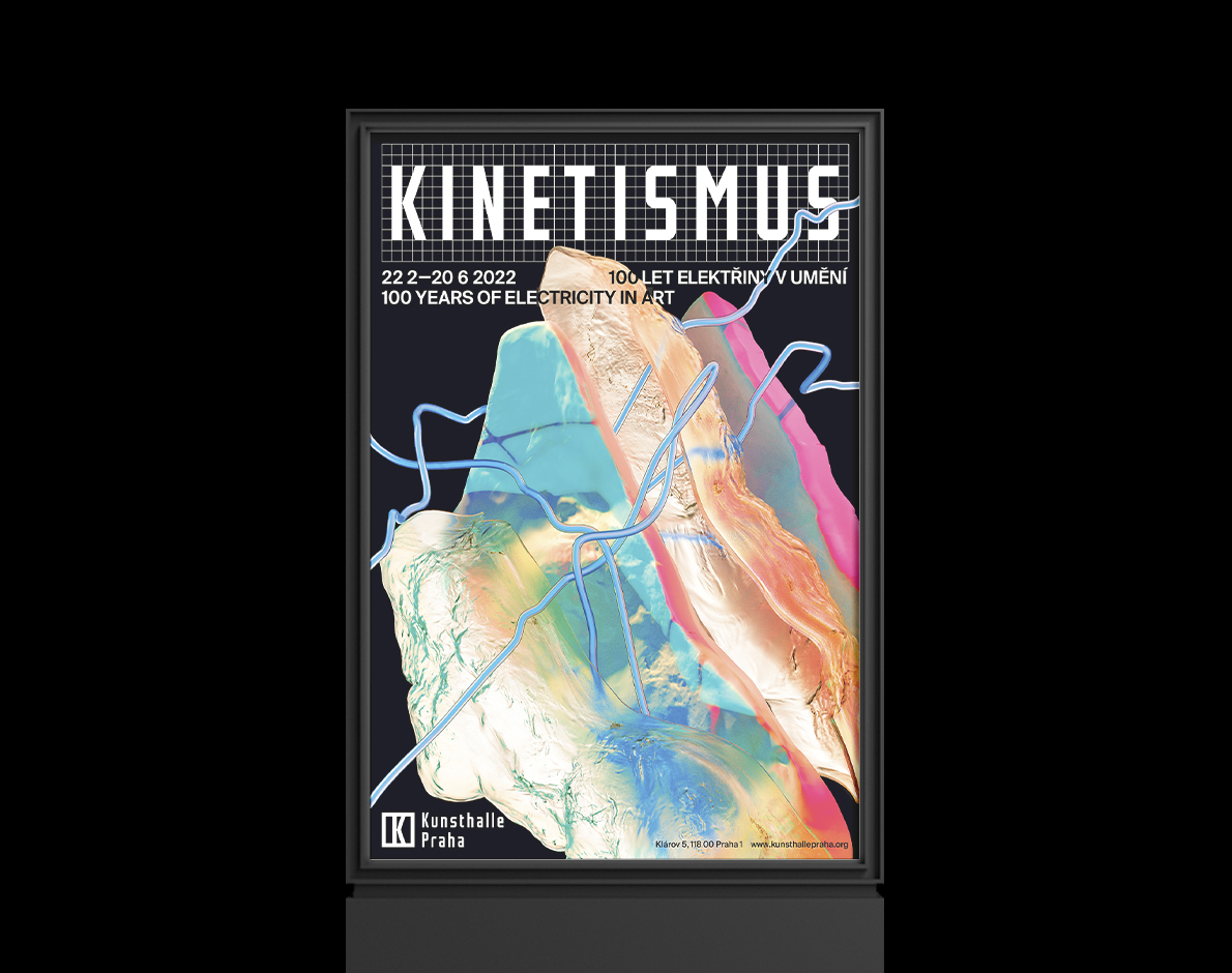
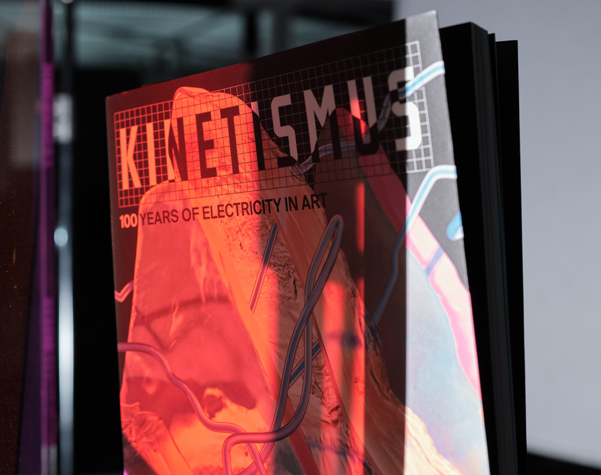
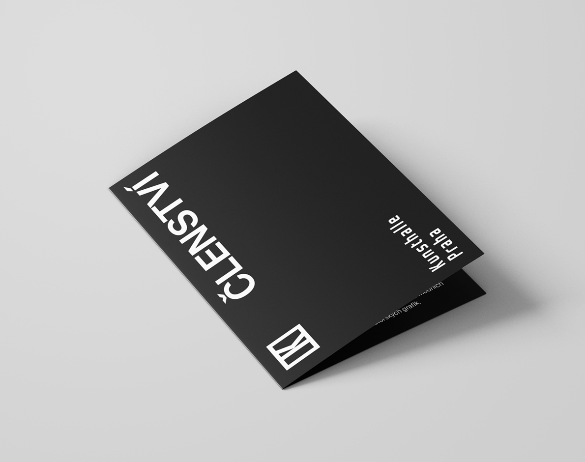
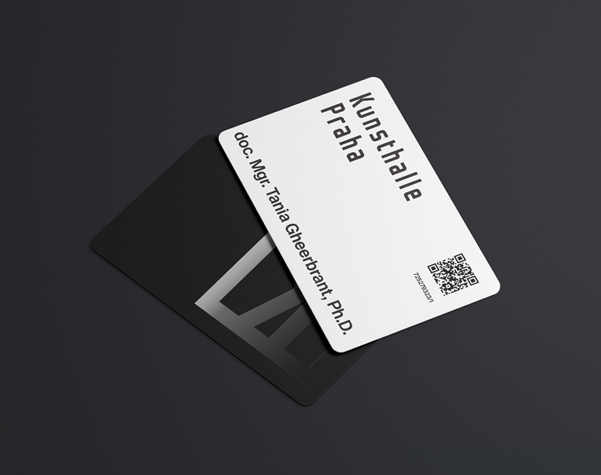
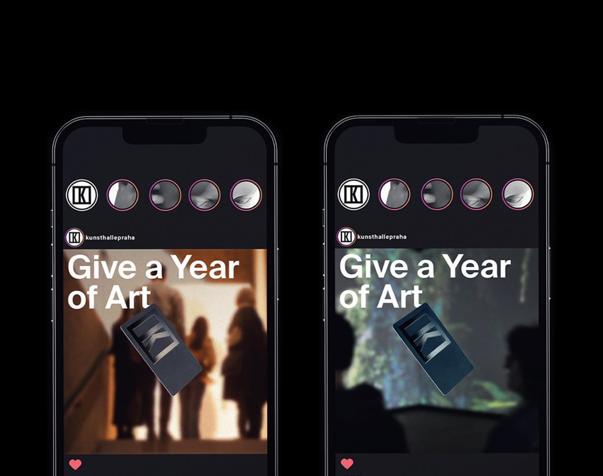
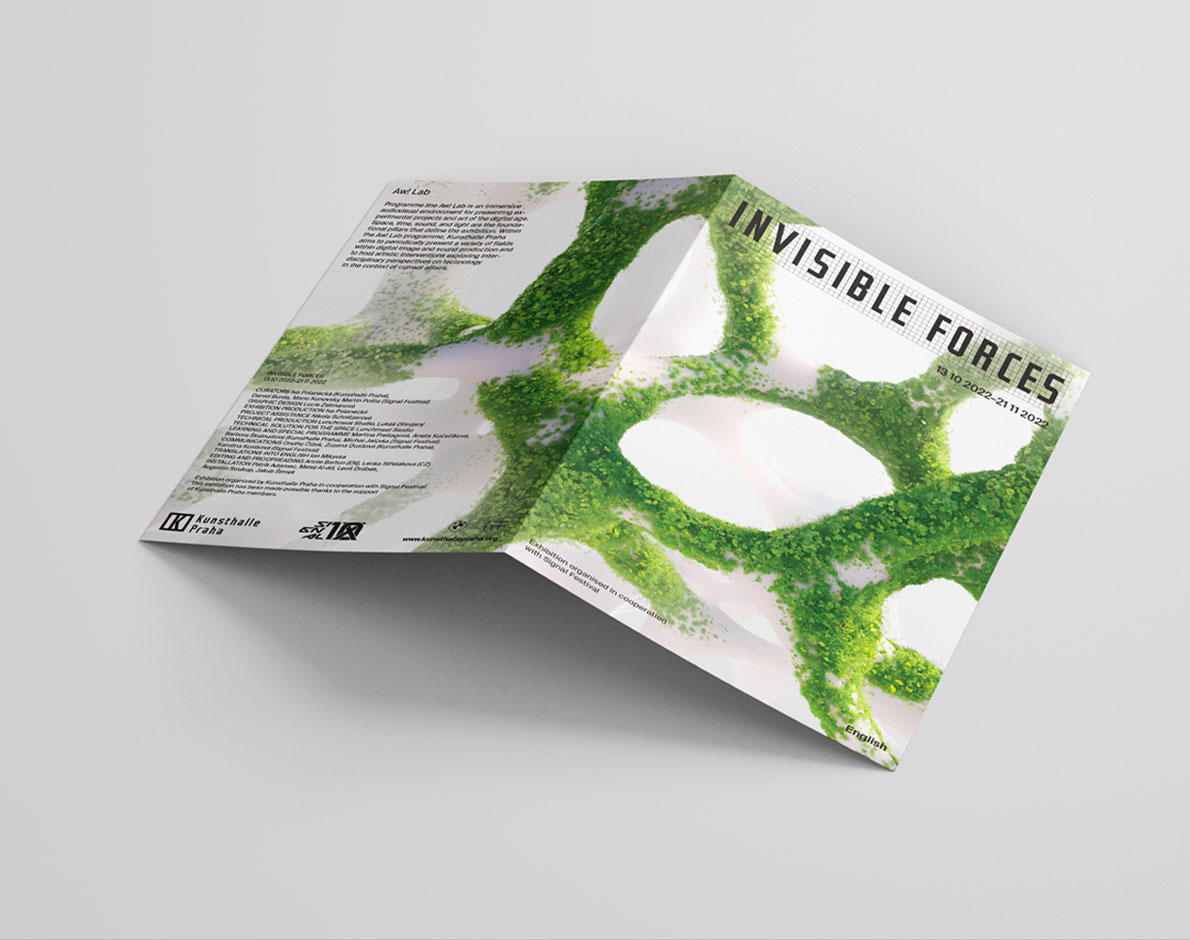
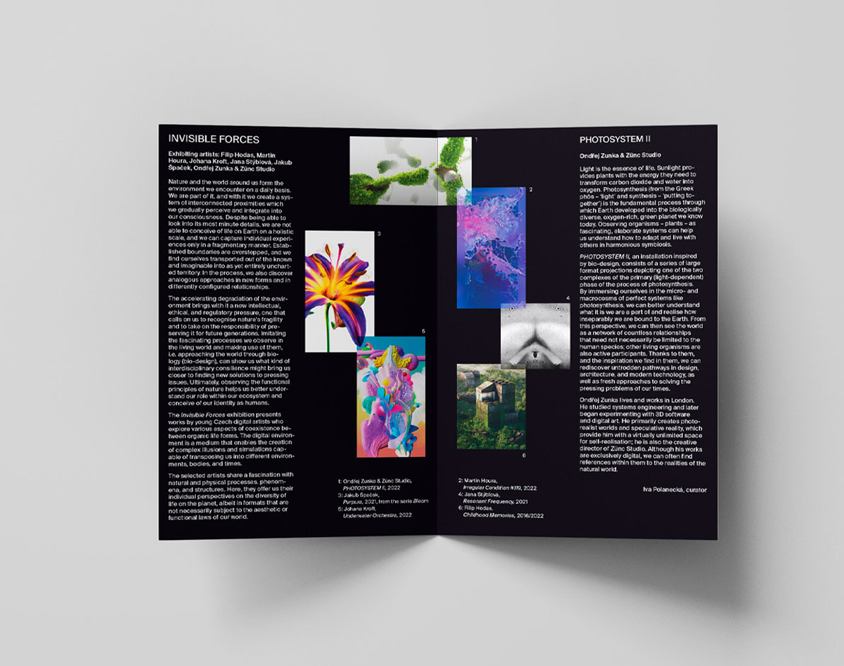
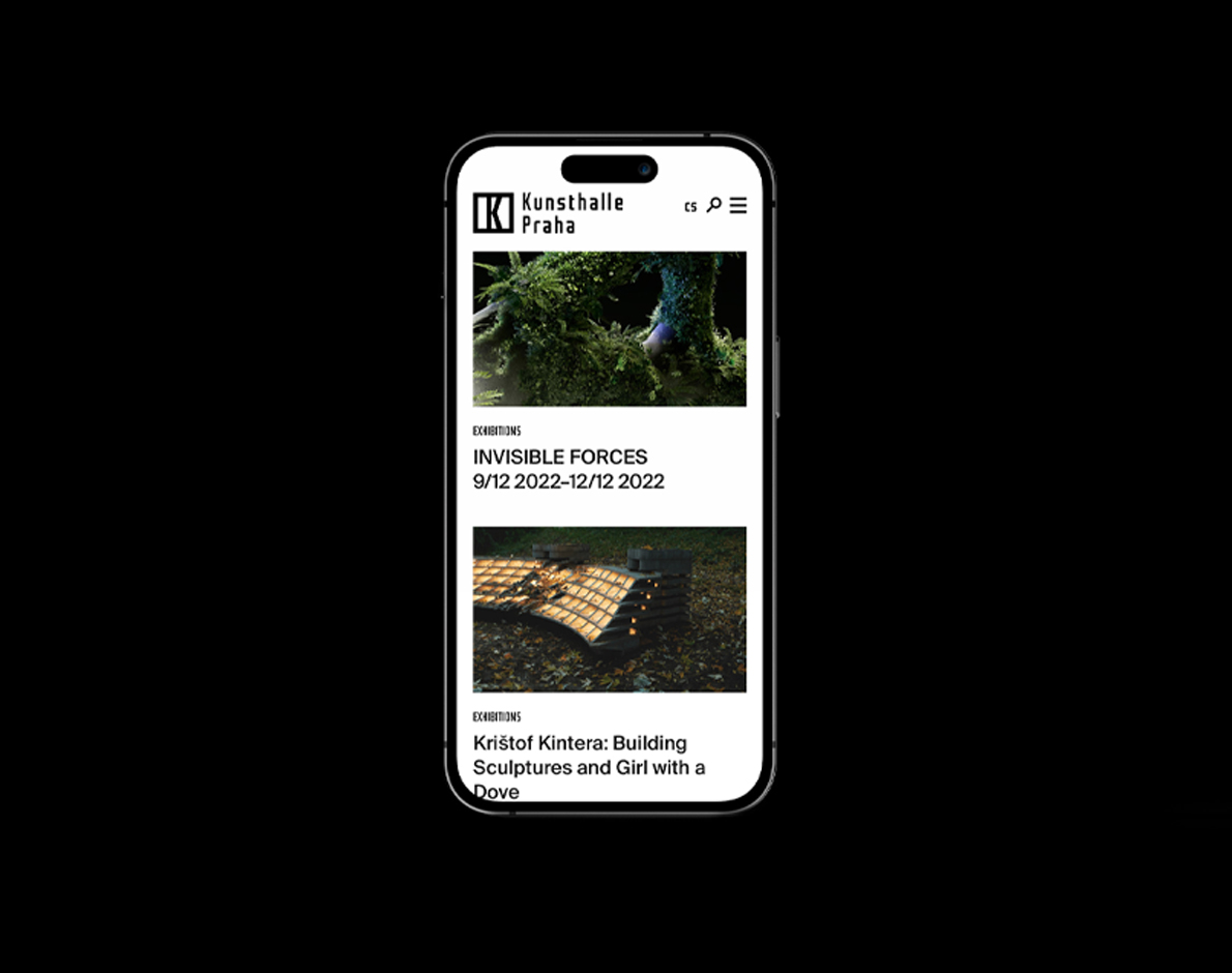
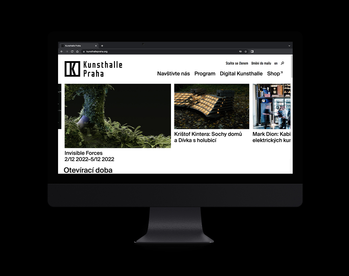
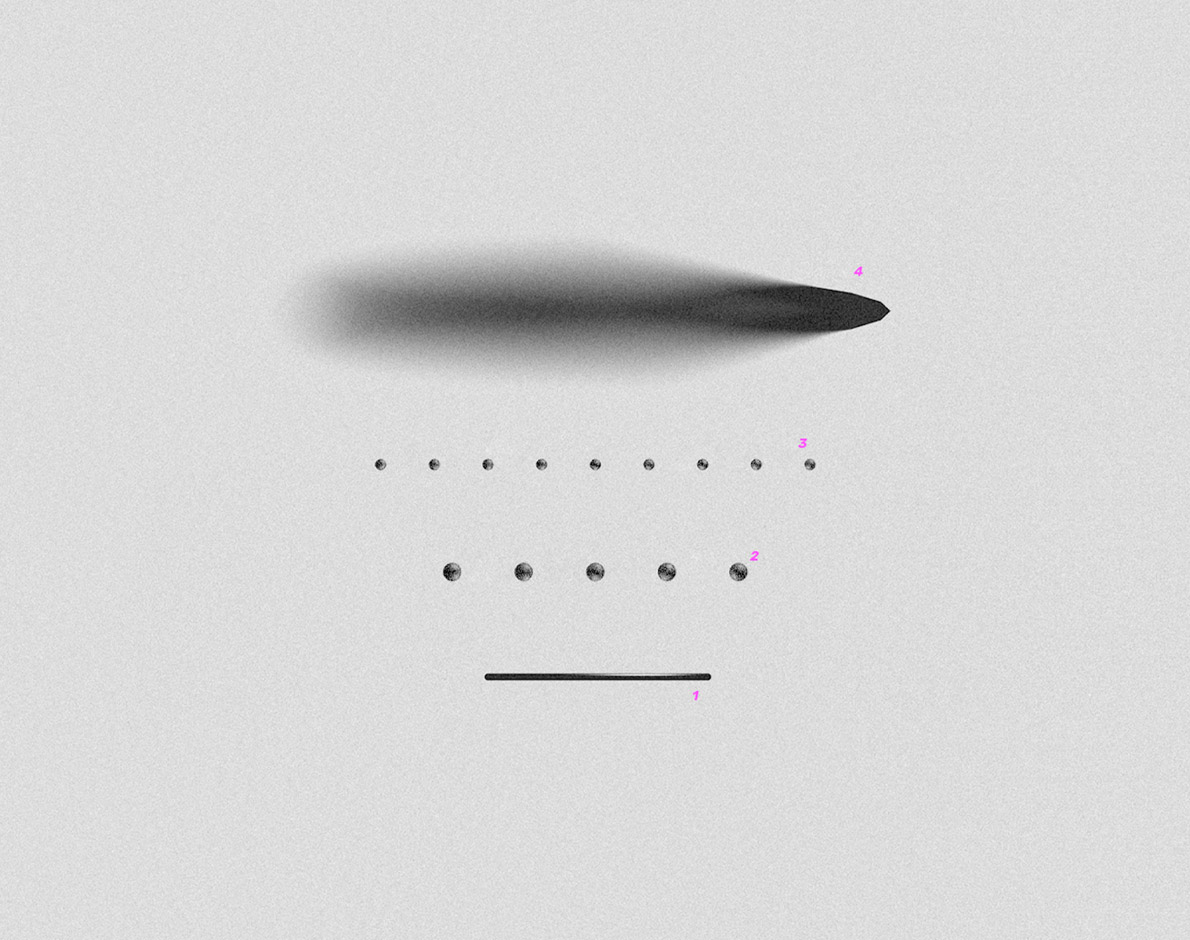
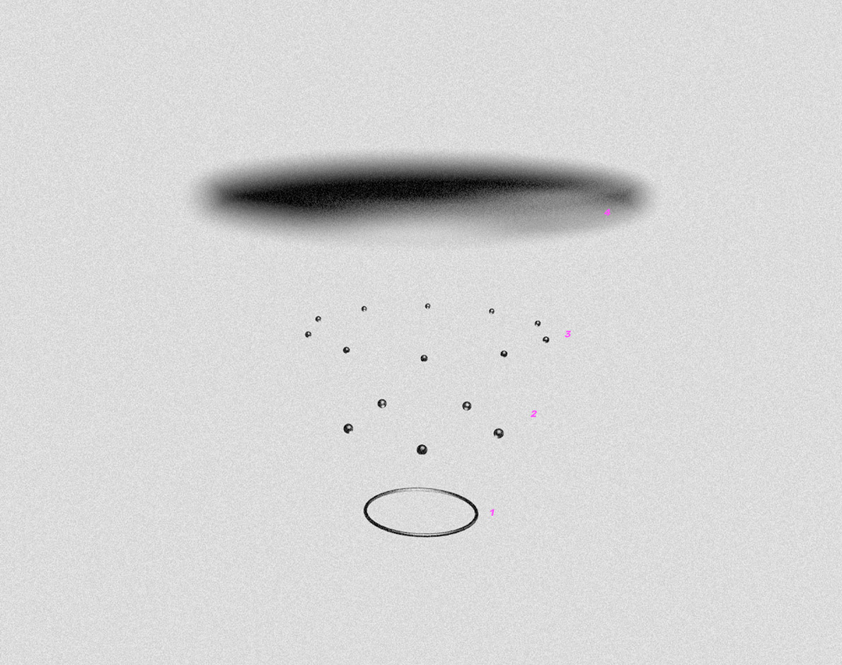
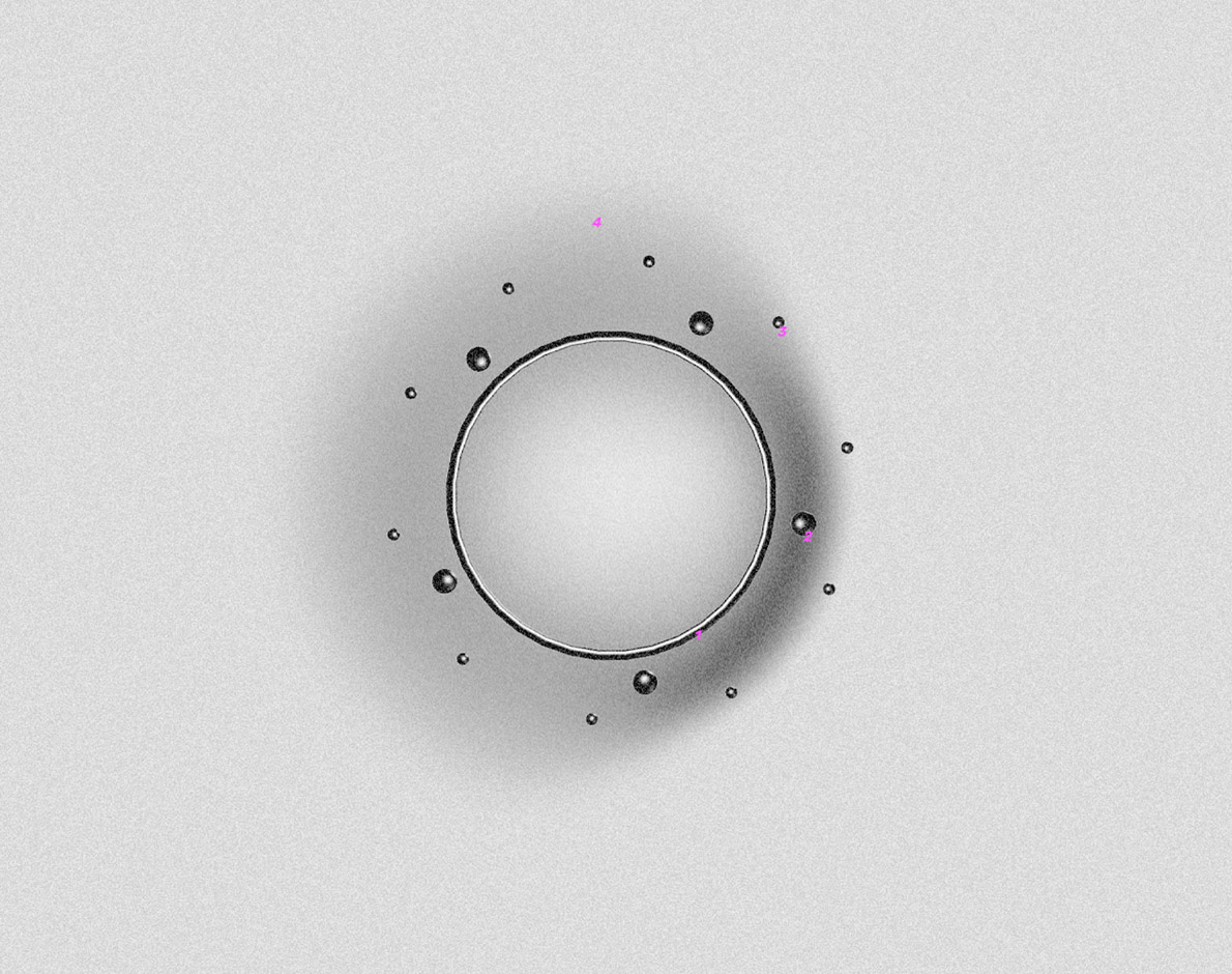
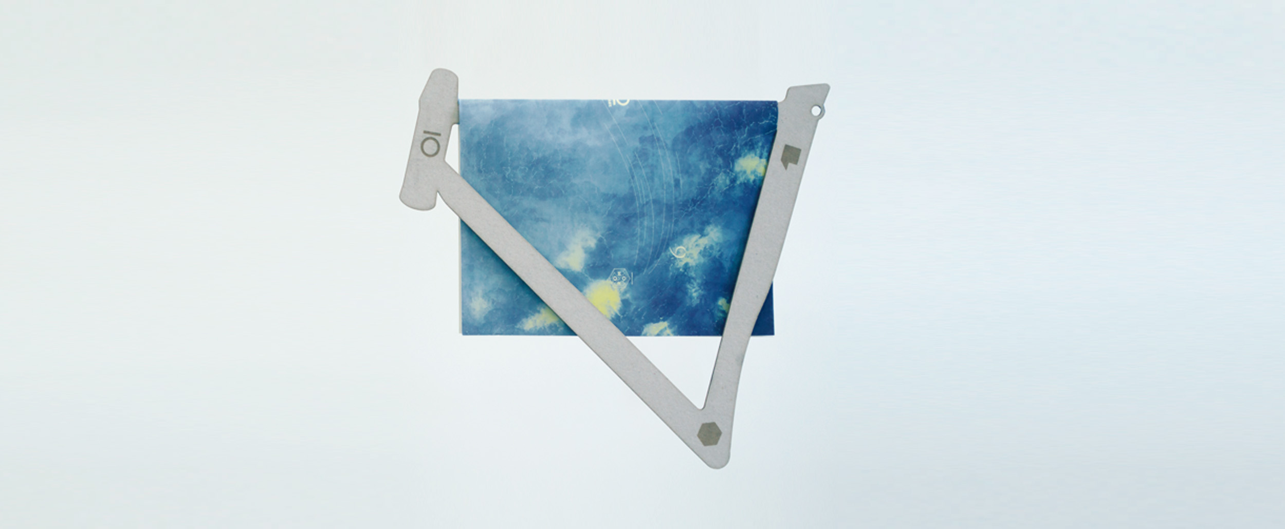
My job was to transform the identity of an institution from modernist to contemporary by being in charge of supervising the visual identity ecosystem. The visual identity is based on two elements: the typography which is very technical and refers to the history of the building, as well as the contrasting element, which is balanced by a carefully selected juicy visual component.
Brand Identity
BRAND IDENTITY MANAGEMENT ART DIRECTION GRAPHIC DESIGN UX
Kunsthalle Praha
Brand Identity
BRAND IDENTITY MANAGEMENT ART DIRECTION GRAPHIC DESIGN UX
My job was to transform the identity of an institution from modernist to contemporary by being in charge of supervising the visual identity ecosystem.
The visual identity is based on two elements: the typography which is very technical and refers to the history of the building, as well as the contrasting element, which is balanced by a carefully selected juicy visual component.
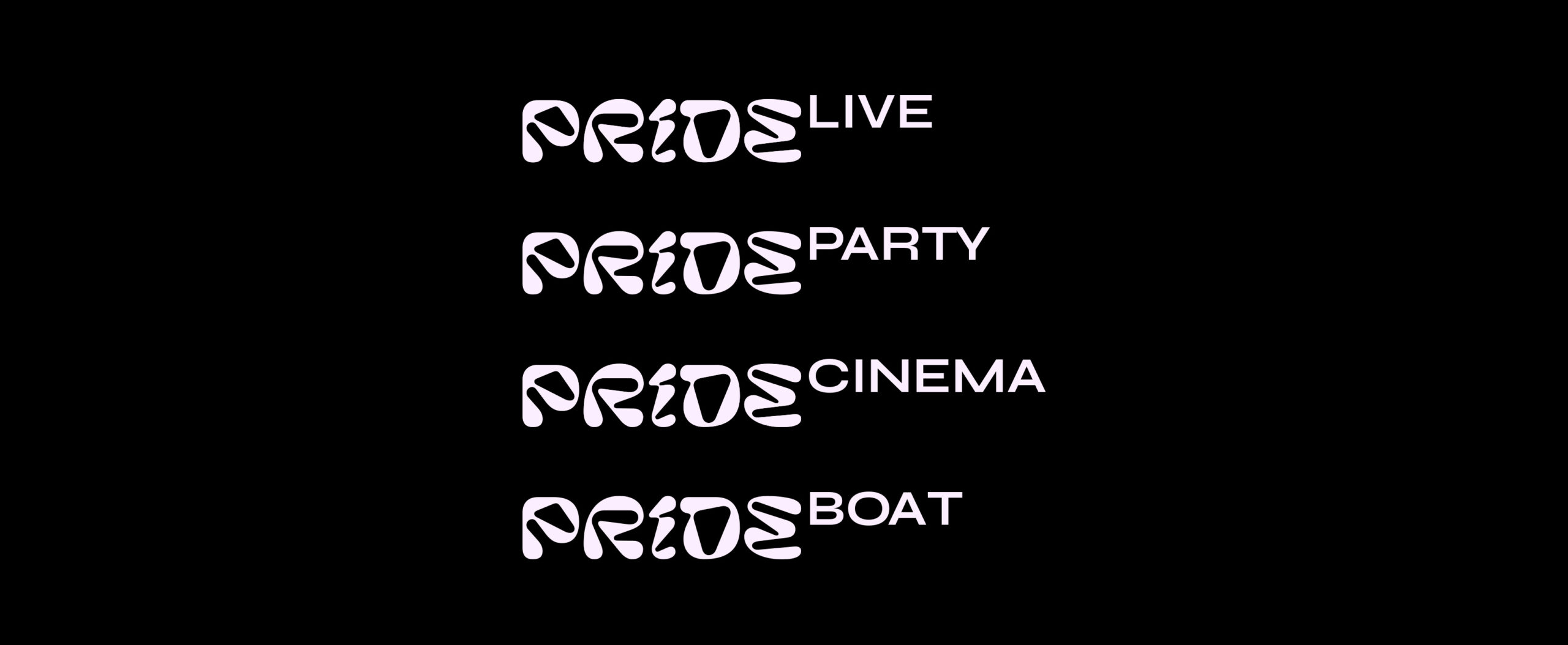
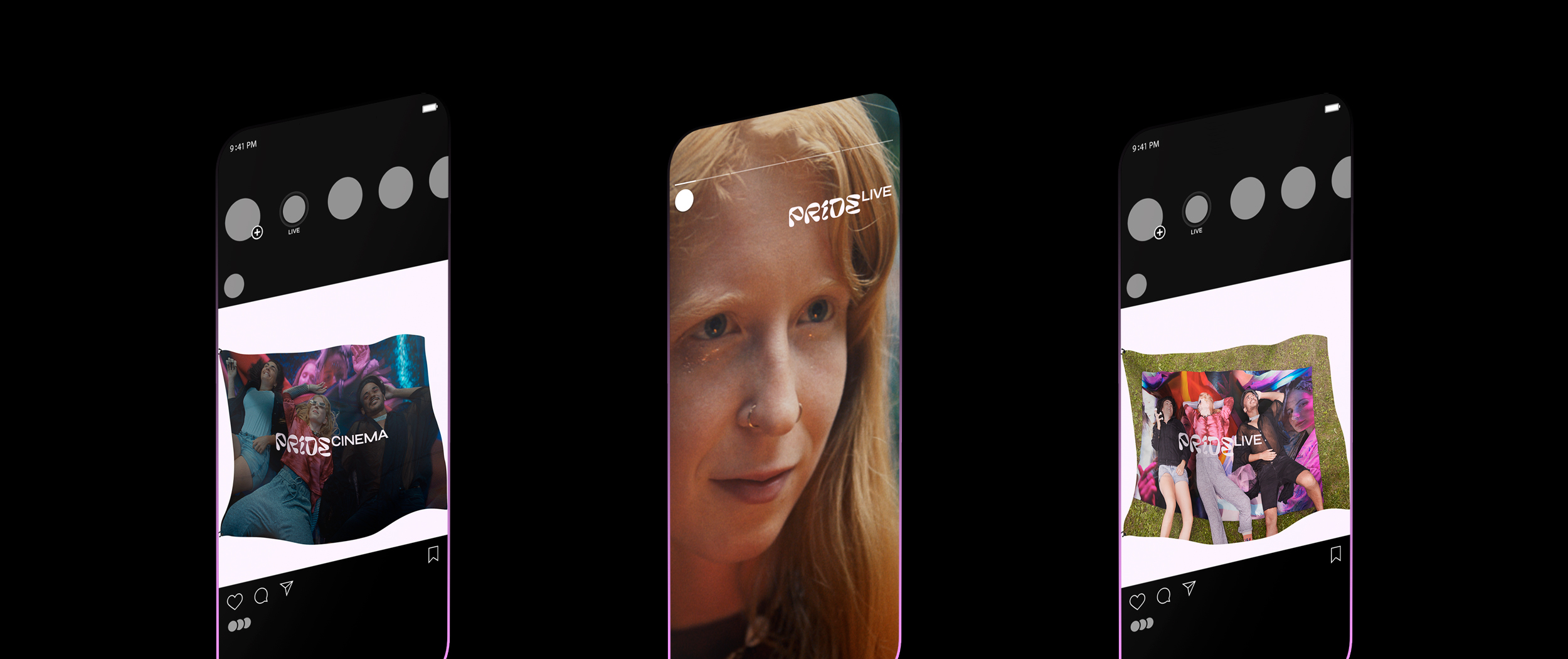
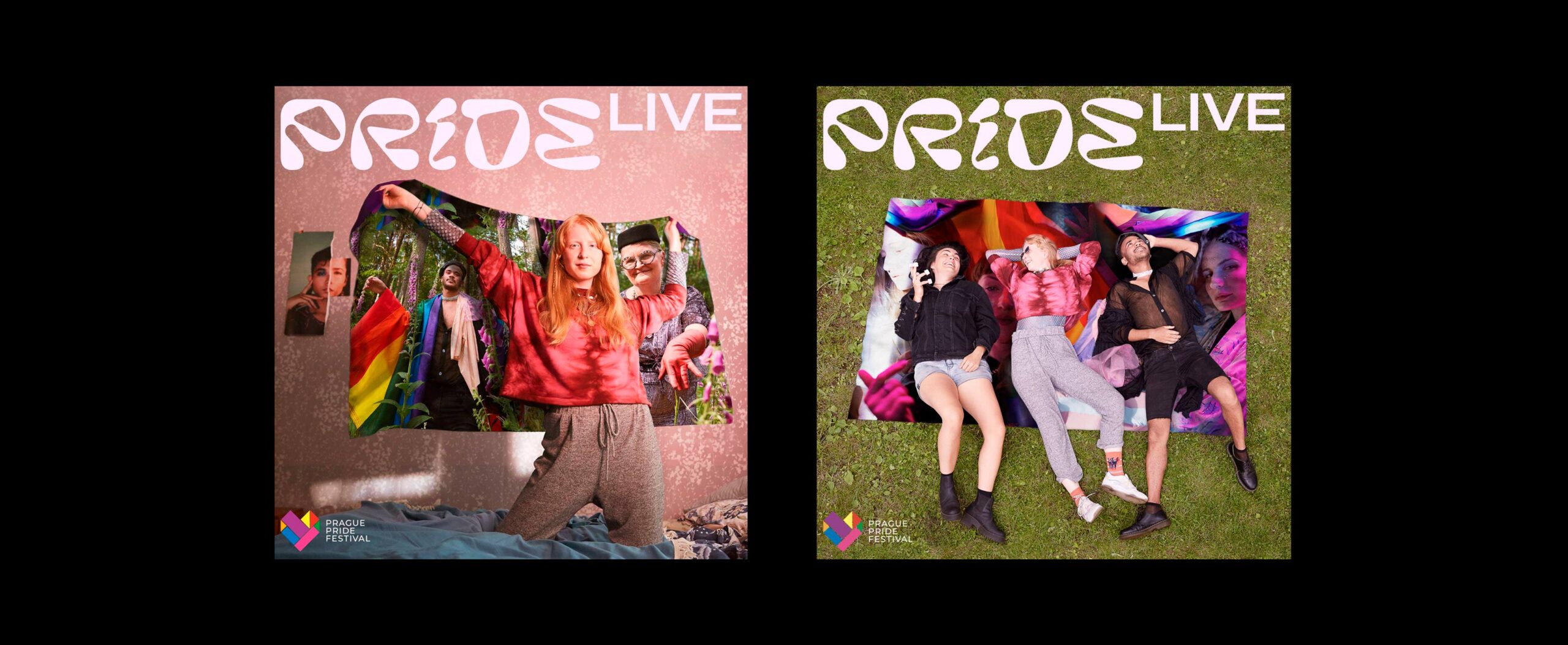
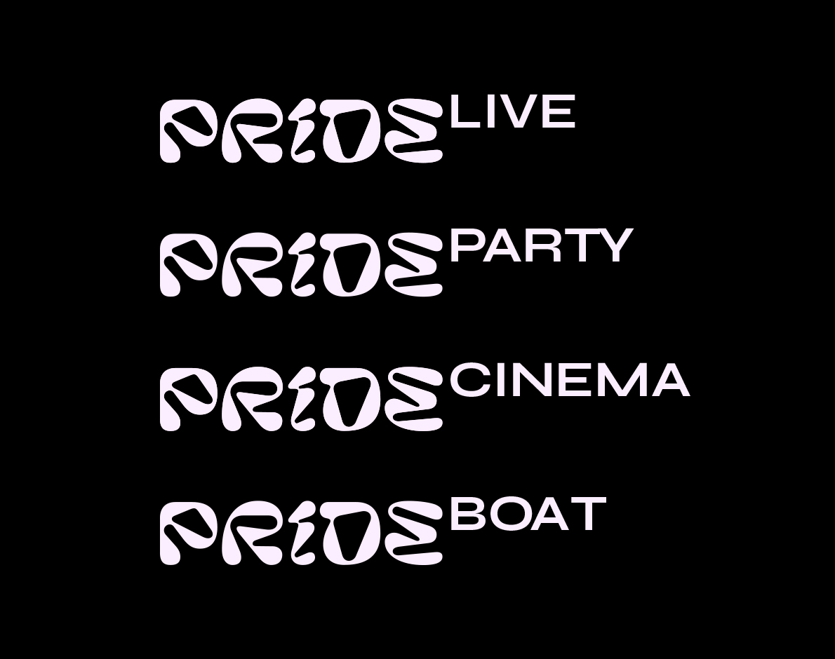
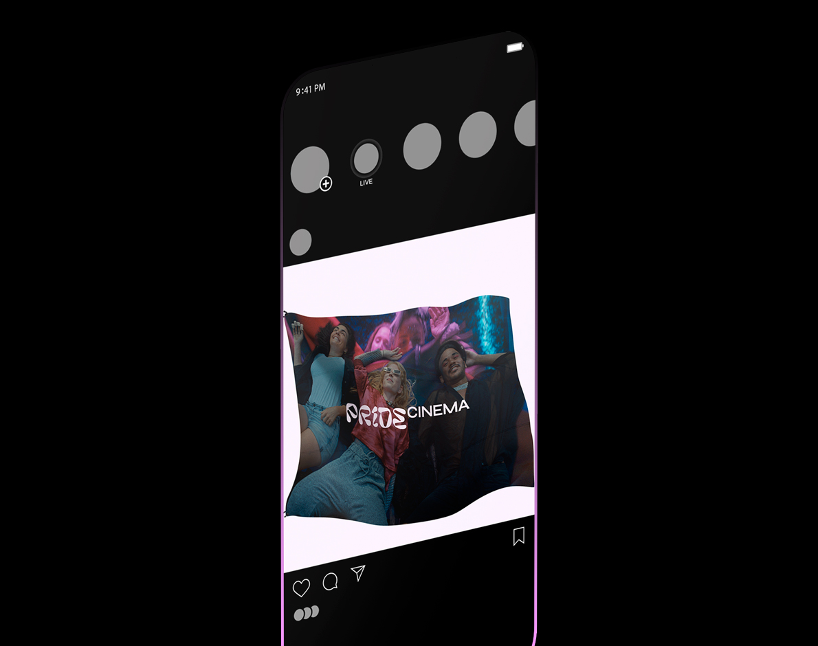
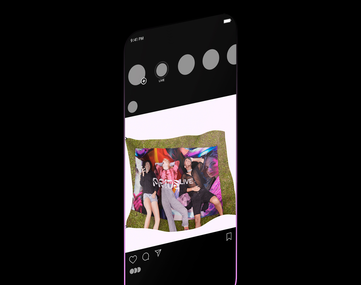
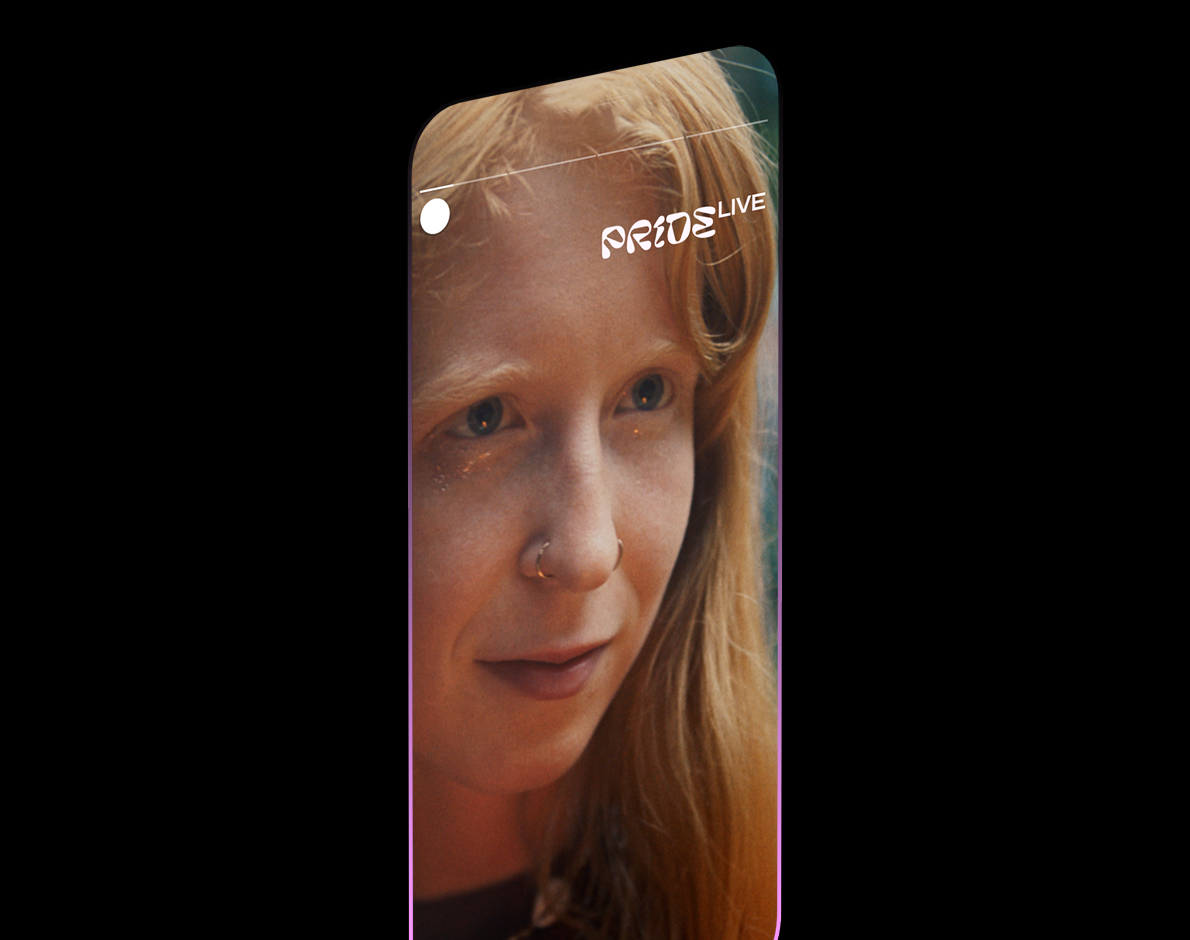
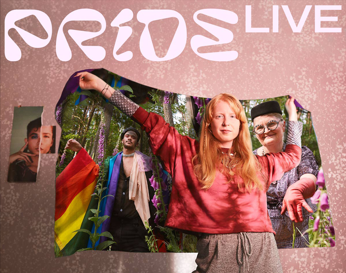
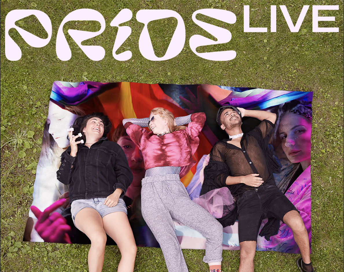
The festival took place during the first waves of covid. The concept was to create communication between people and the Pride festival despite physical limits. For this purpose we used the rainbow flag symbol which worked as a communication channel between people who cannot be physically together. The flag acted like a screen and had the ability to transport people and thus connected them into the atmosphere of the festival.
Prague PRide
The festival took place during the first waves of covid. The concept was to create communication between people and the Pride festival despite physical limits. For this purpose we used the rainbow flag symbol which worked as a communication channel between people who cannot be physically together. The flag acted like a screen and had the ability to transport people and thus connected them into the atmosphere of the festival.
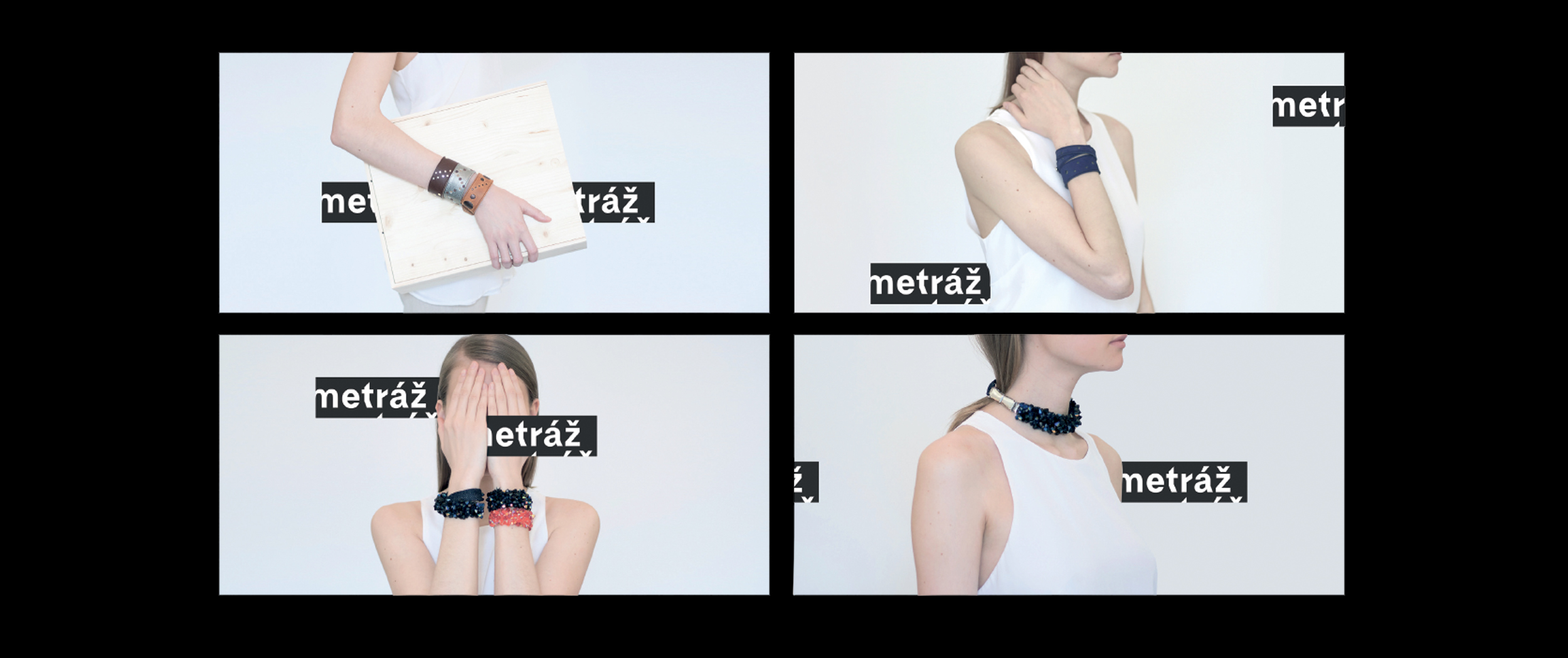
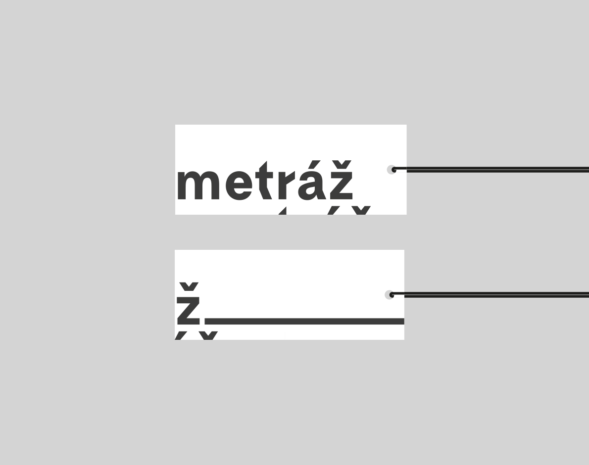
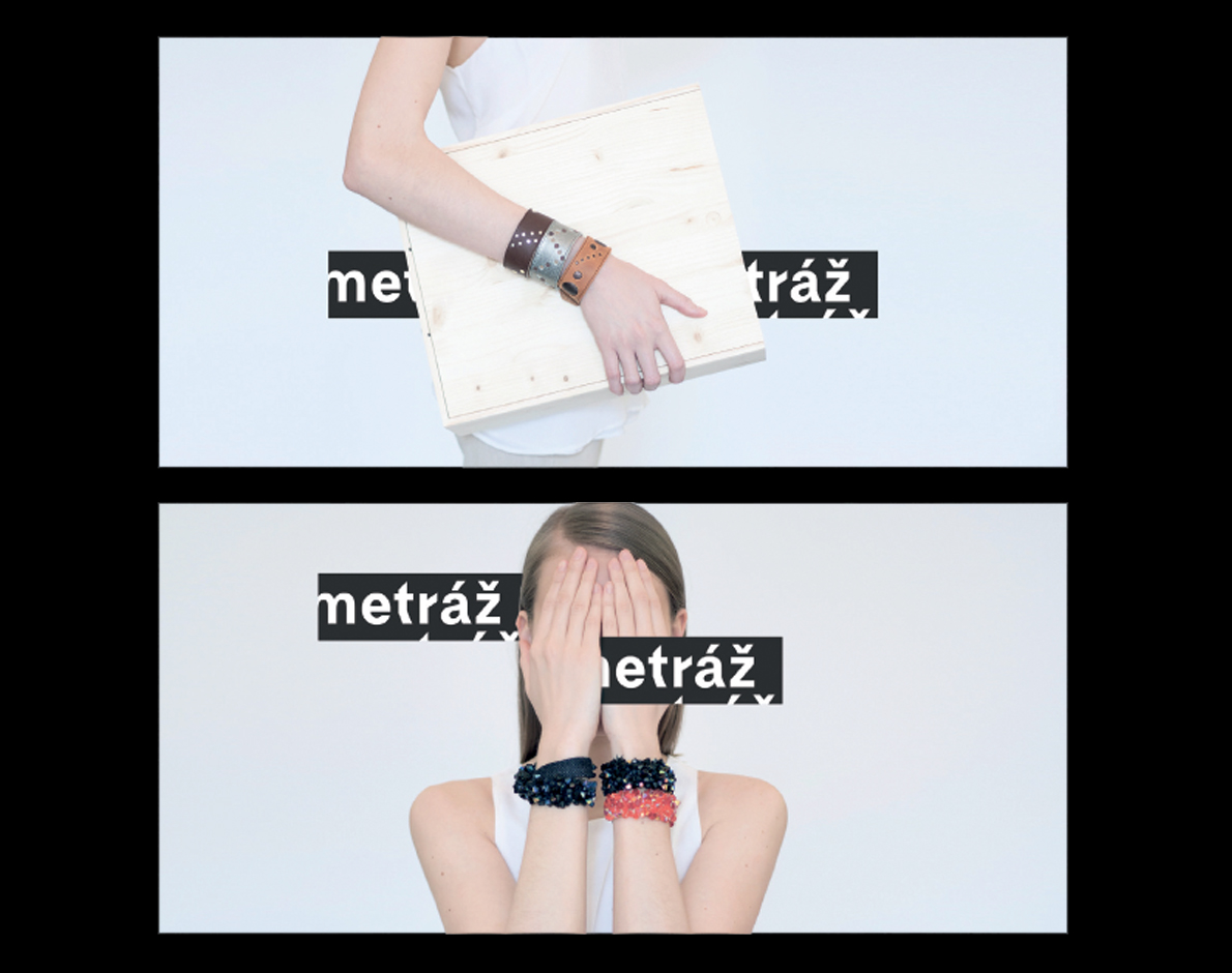
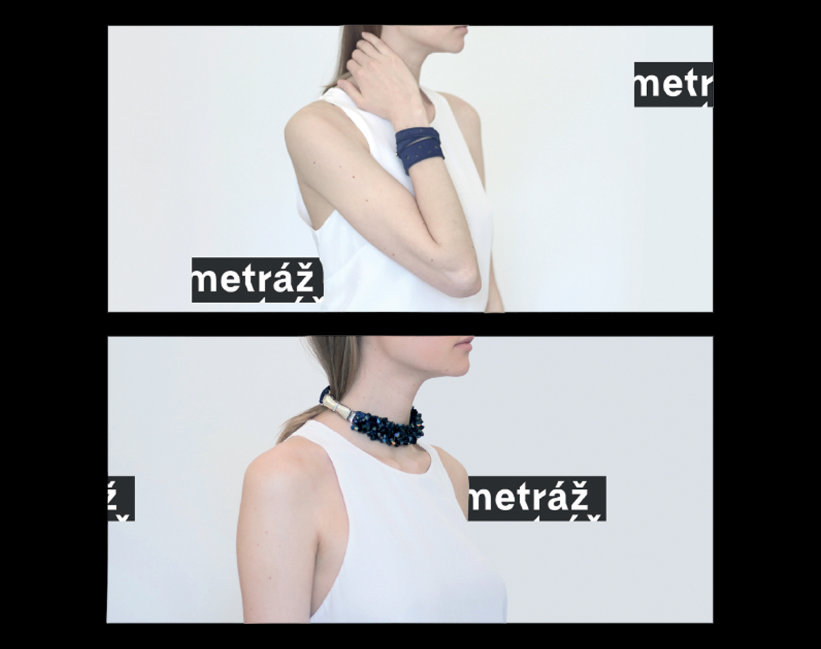
Metráž is a low-threshold workshop for women who find themselves in difficult social situations. It serves as a space where women at risk of social exclusion, violence, homelessness and poverty collaborate to create designer accessories and fashion items. The goal of the project is to support these women by offering them creative work opportunities, motivation, know-how, and a means of income.
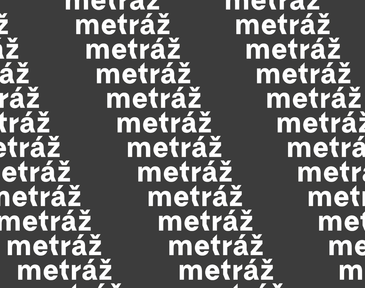
Metráž means „metrage“. I designed a brand identity based on two key concepts. The first is a digital „metrage“ with a pattern created from the word „metráž“. The second is an endless ribbon with the word „metráž“ repeated continuously. The identity is responsive, behaving just like a ribbon or a piece of fabric—allowing you to „cut“ any length you need.
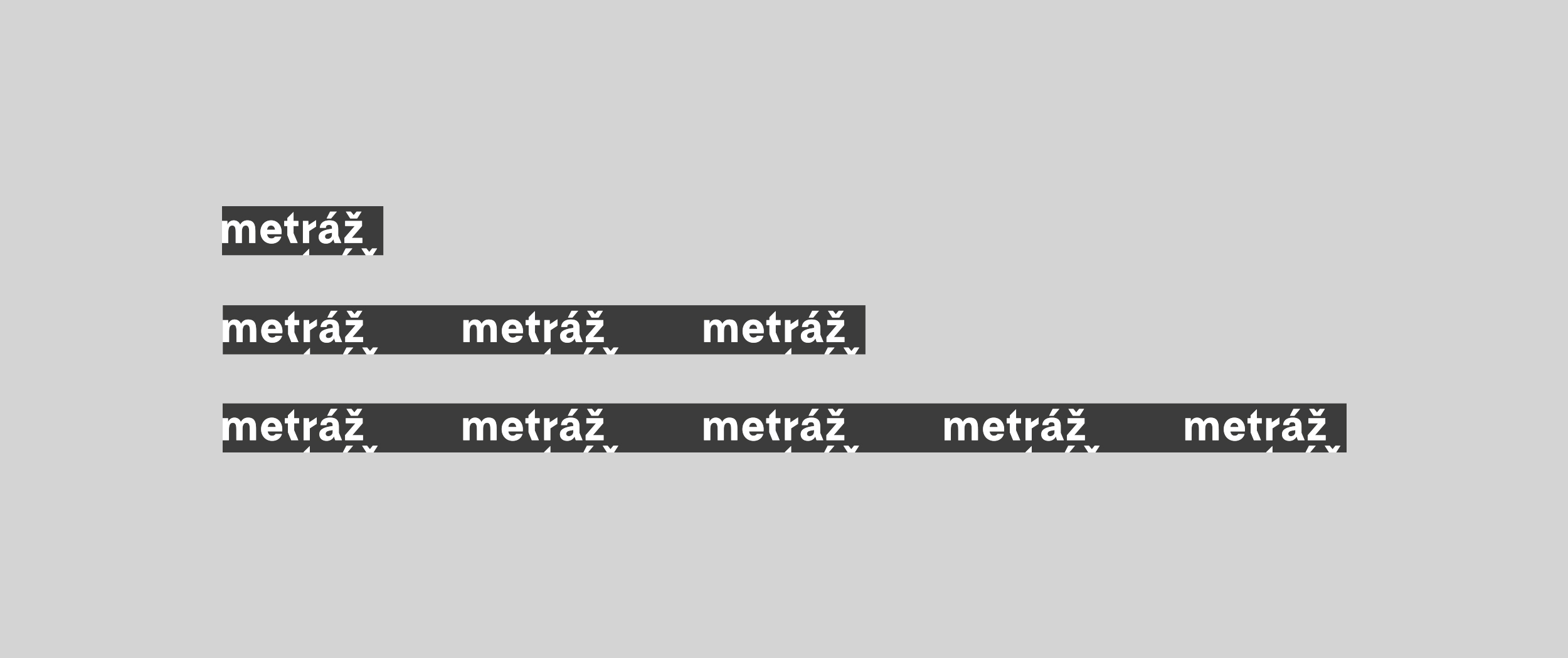
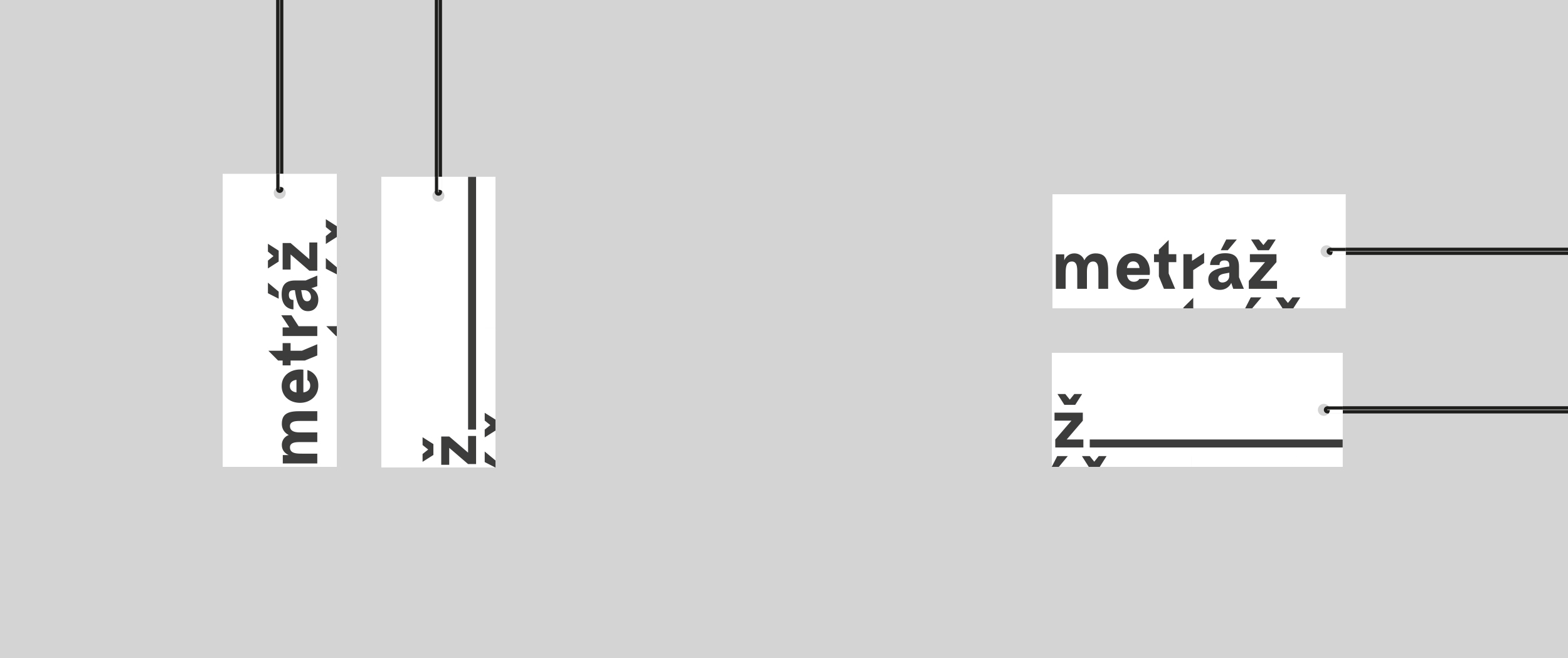
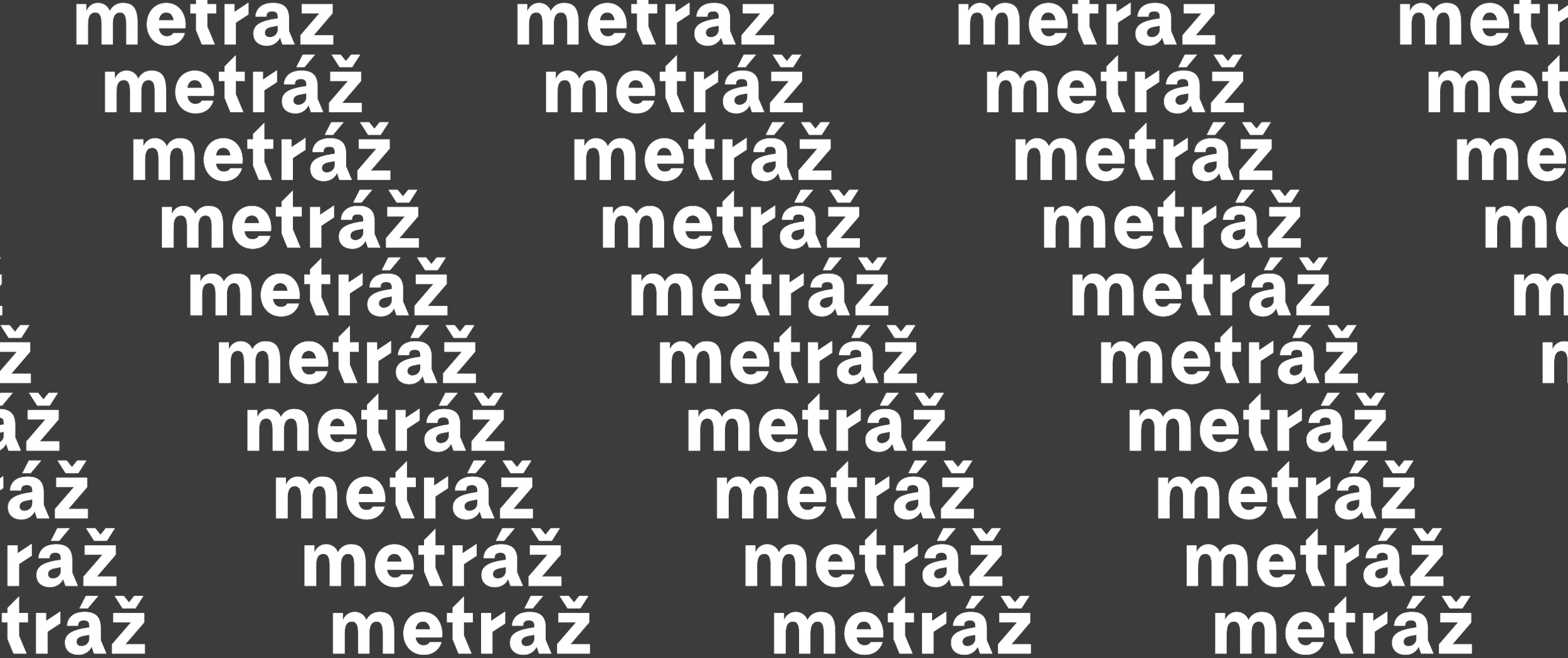
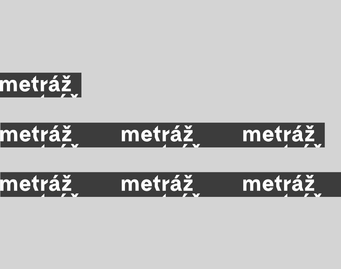
Metráž
Metráž is a low-threshold workshop for women who find themselves in difficult social situations. It serves as a space where women at risk of social exclusion, violence, homelessness and poverty collaborate to create designer accessories and fashion items. The goal of the project is to support these women by offering them creative work opportunities, motivation, know-how, and a means of income.
Metráž means „metrage“. I designed a brand identity based on two key concepts. The first is a digital „metrage“ with a pattern created from the word „metráž“. The second is an endless ribbon with the word „metráž“ repeated continuously. The identity is responsive, behaving just like a ribbon or a piece of fabric—allowing you to „cut“ any length you need.
Brand Identity
Branding Art Direction
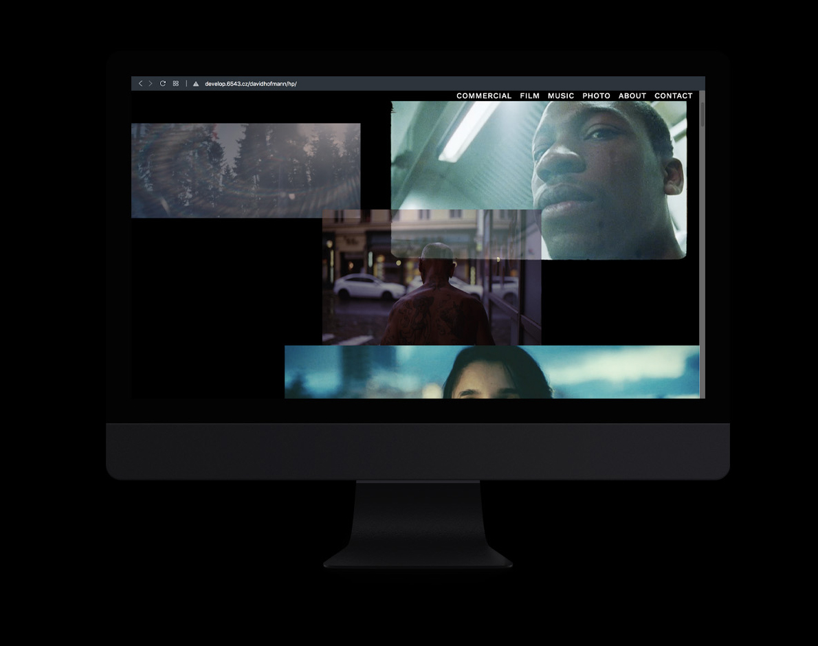
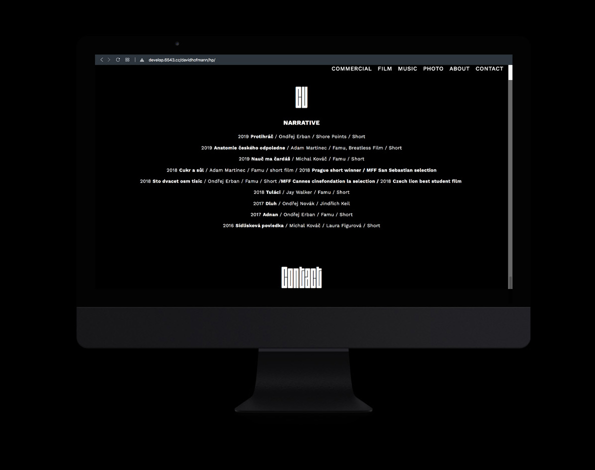
David hofmann cinematographer
Web design
I designed a website for a Cinematographer who is a passionate skateboarder. Since his work is influenced by skateboarding, I have implemented sliding and layered images that are a reference to his unique camera movement style.
DAVID HOFMANN CINEMATOGRAPHER
I designed a website for a Cinematographer who is a passionate skateboarder. Since his work is influenced by skateboarding, I have implemented sliding and layered images that are a reference to his unique camera movement style.
Web design
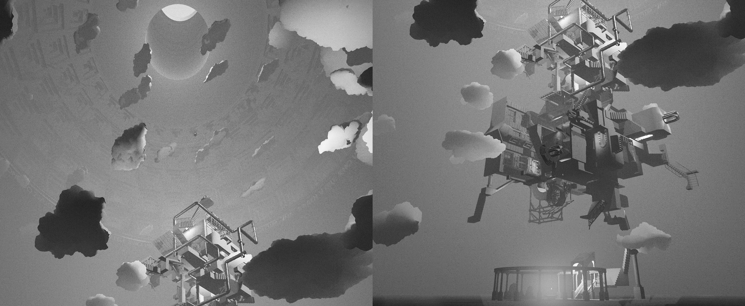
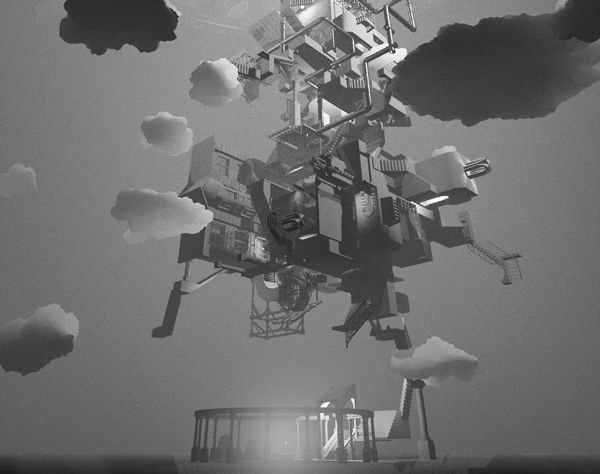
Rhorodeous
pantheon
VR Game
DESIGN DEVELOPMENT
w/ dear Jonatan Kuna & Eliáš Bauhaus
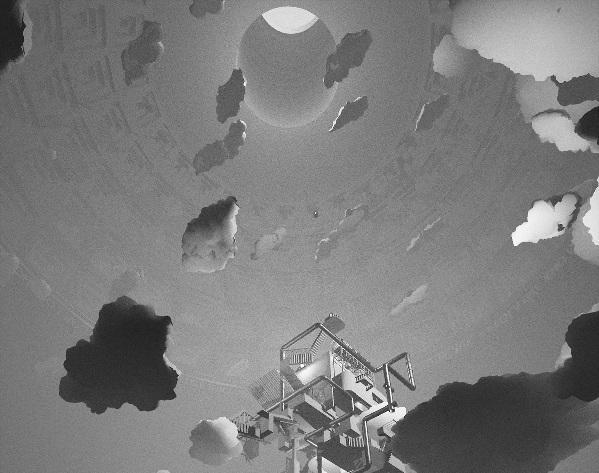
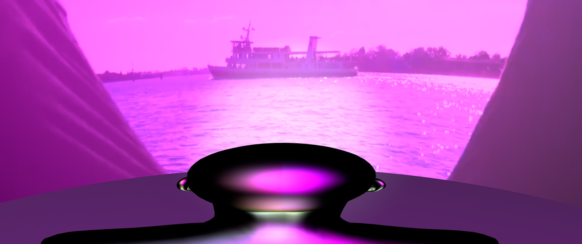
This virtual reality game lets players lose themselves in a loop of radical changes in the scale of both architecture and themselves.
Rhorodeous
pantheon
This virtual reality game lets players lose themselves in a loop of radical changes in the scale of both architecture and themselves.
VR Game
DESIGN DEVELOPMENT
w/ dear Jonatan Kuna & Eliáš Bauhaus
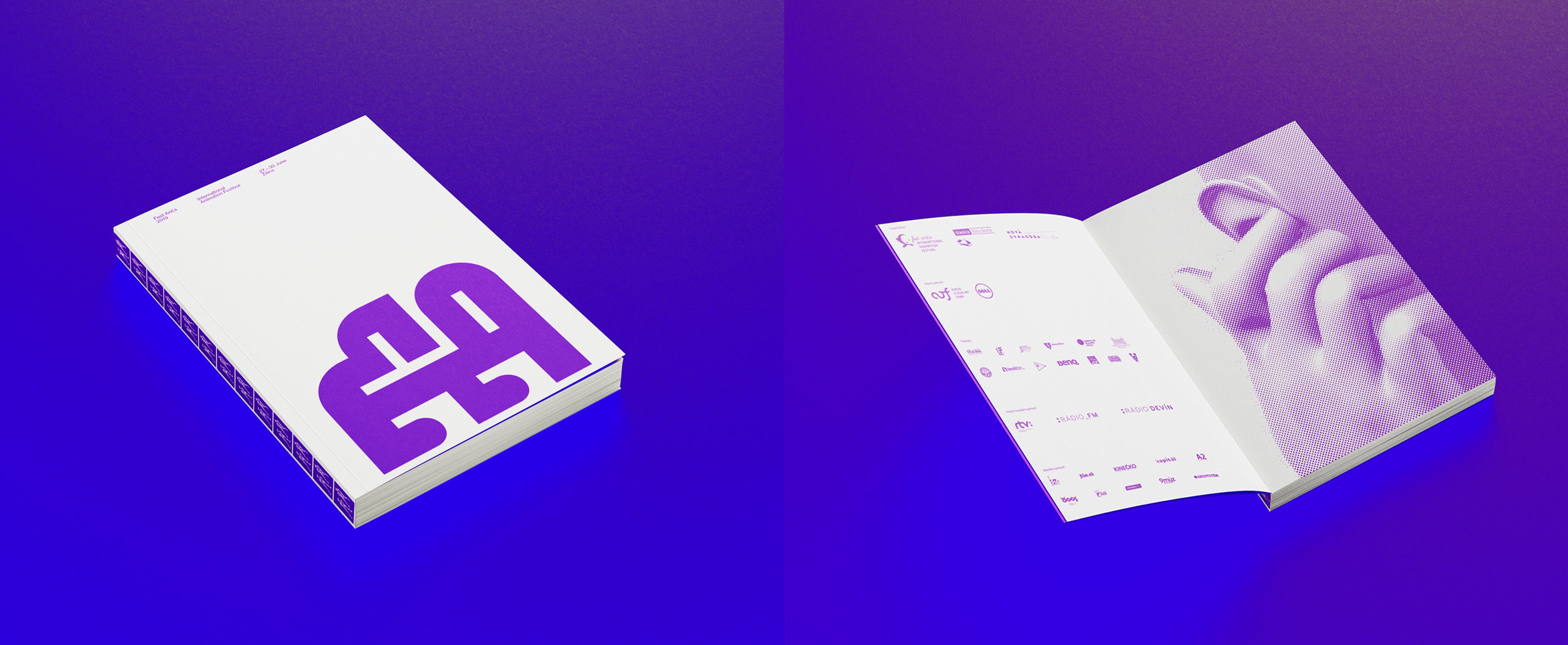
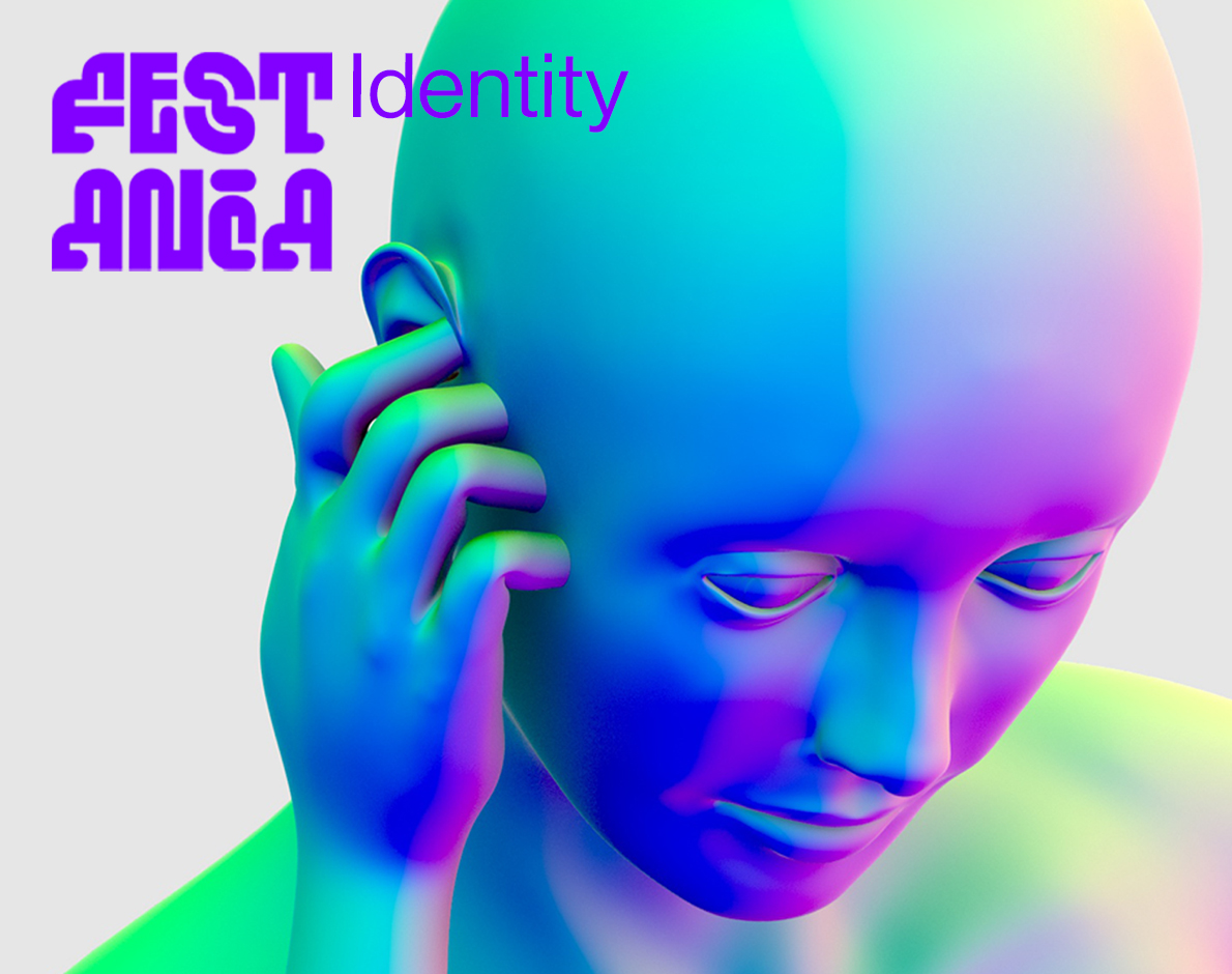
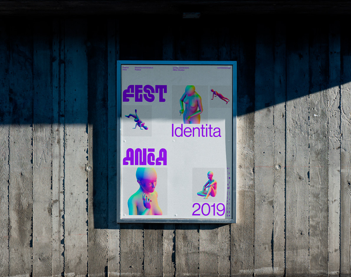
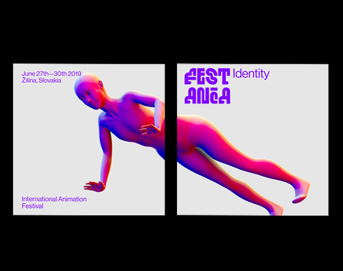
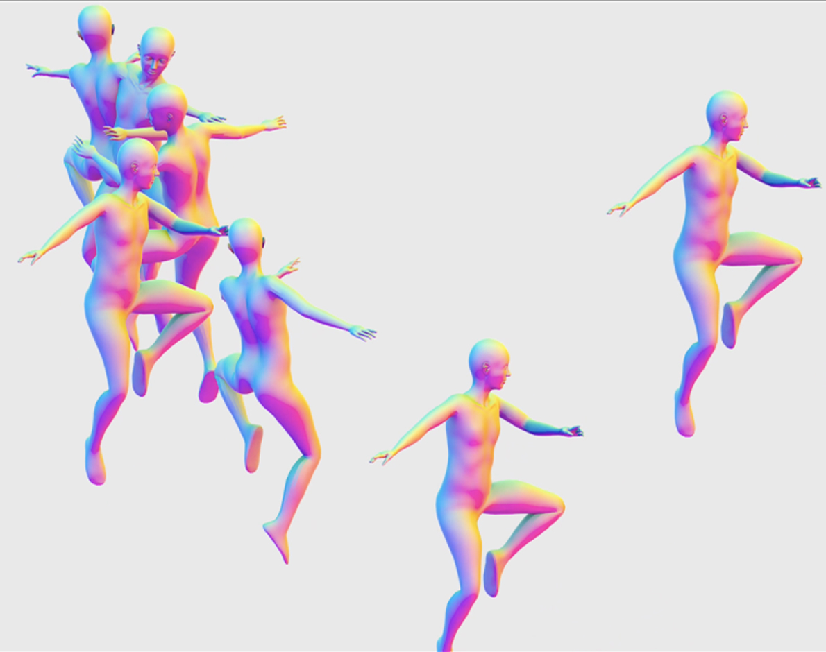
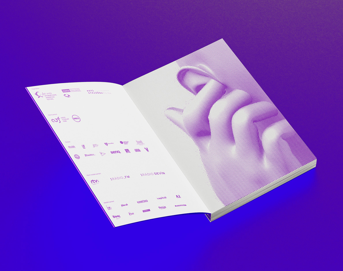
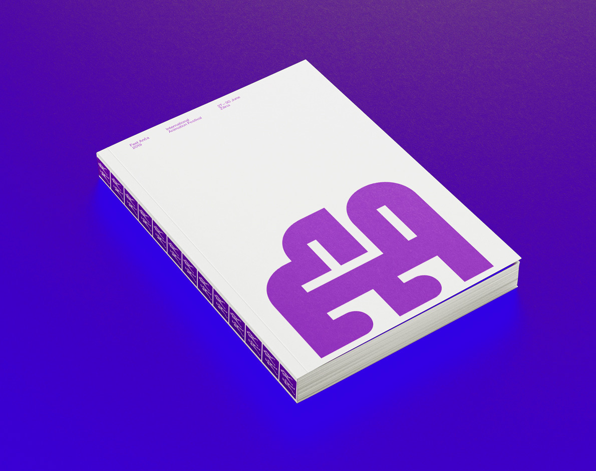
International animation festival Anca
Creative campaign
ART DIRECTION MOTION DESIGN
w/ dear ALžběta Wolfová & Matěj Vojtuš
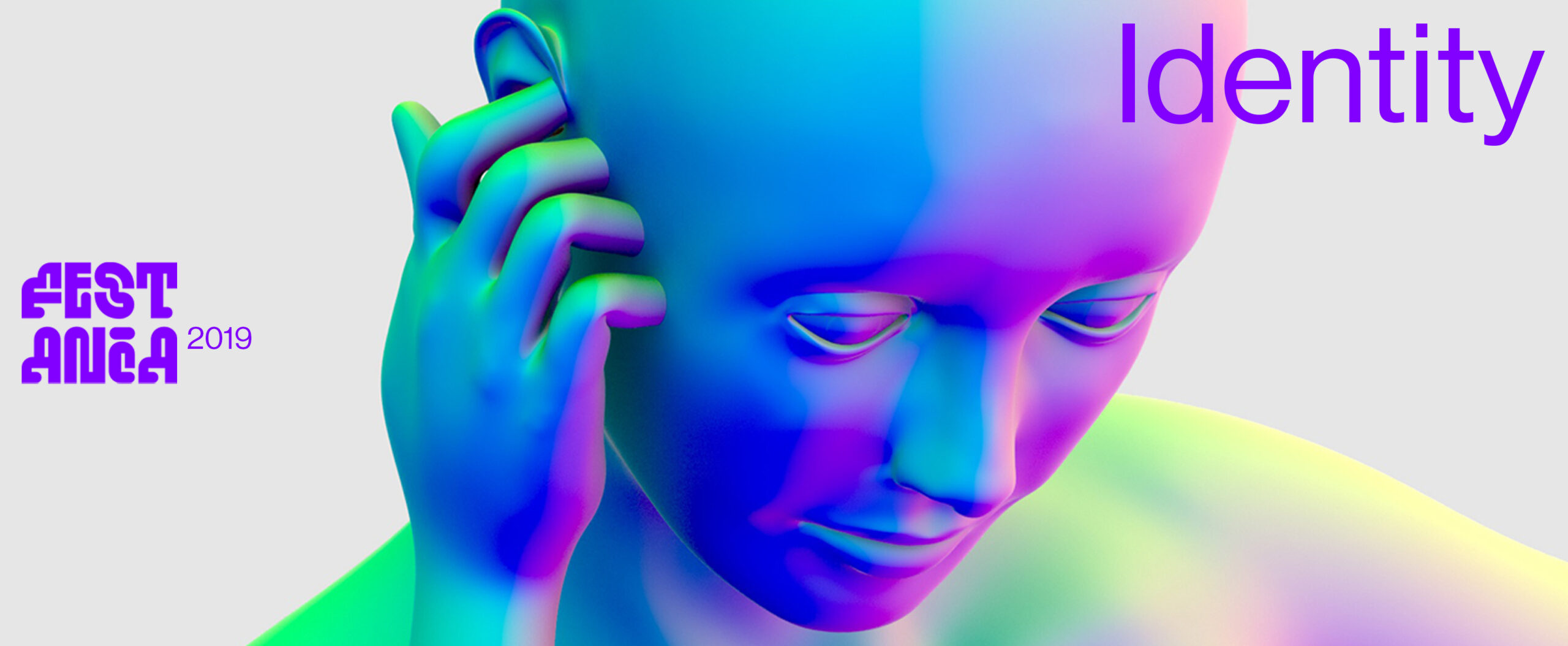
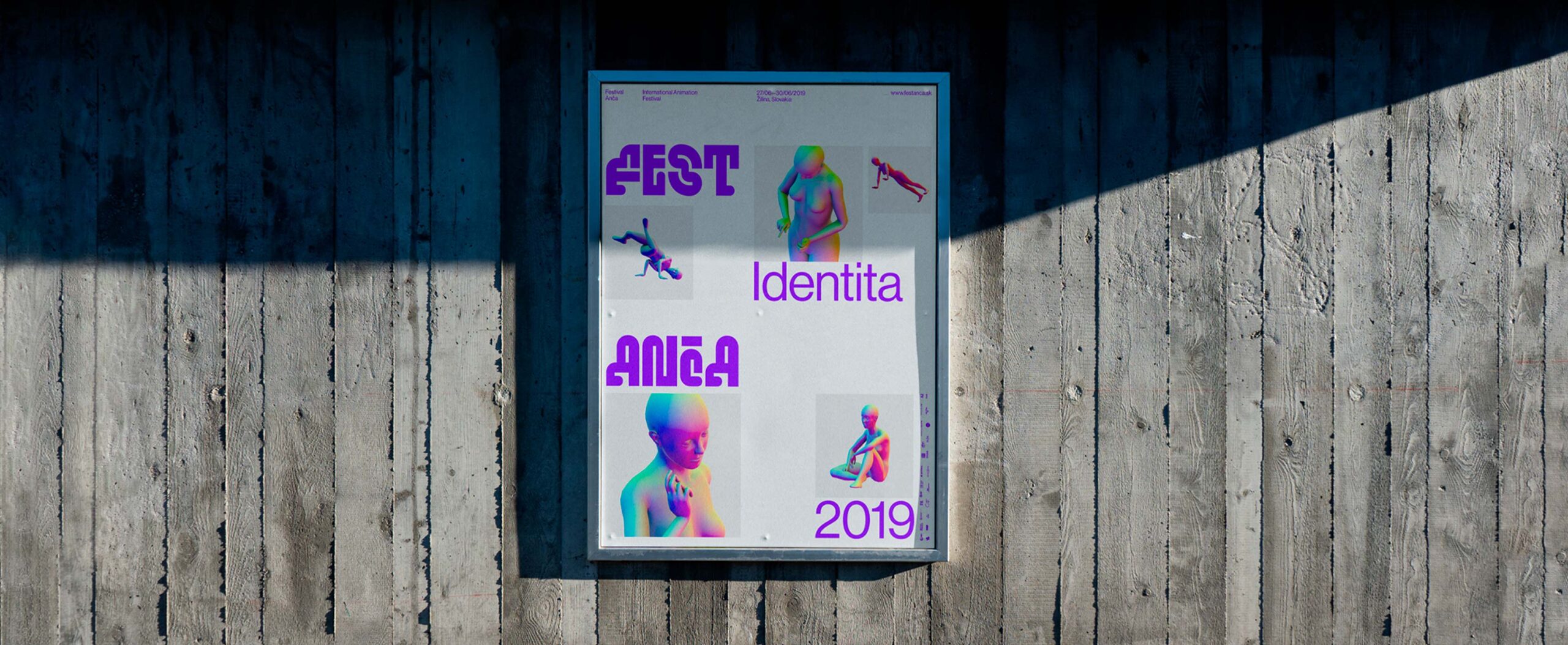
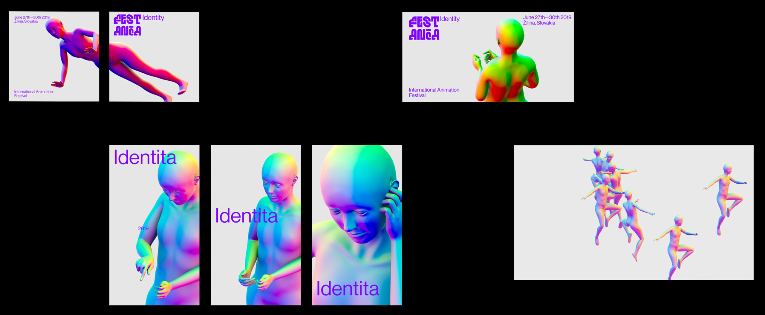
The theme of the film festival was Identity, my team focused on the topic of migrating the identity into a virtual environment. As a visual identity, we personified the festival and created a virtual identity of Anca herself. She took over the festival’s social networks and communicated personally with the festival audience through the silver screens.
INTERNATIONAL ANIMATION FESTIVAL ANCA
The theme of the film festival was Identity, my team focused on the topic of migrating the identity into a virtual environment. As a visual identity, we personified the festival and created a virtual identity of Anca herself. She took over the festival’s social networks and communicated personally with the festival audience through the silver screens.
Creative campaign
ART DIRECTION MOTION DESIGN GRAPHIC DESIGN
w/ dear Alžběta Wolfová & Matěj Vojtuš
VIrtual narratives
Game
GAME DESIGN
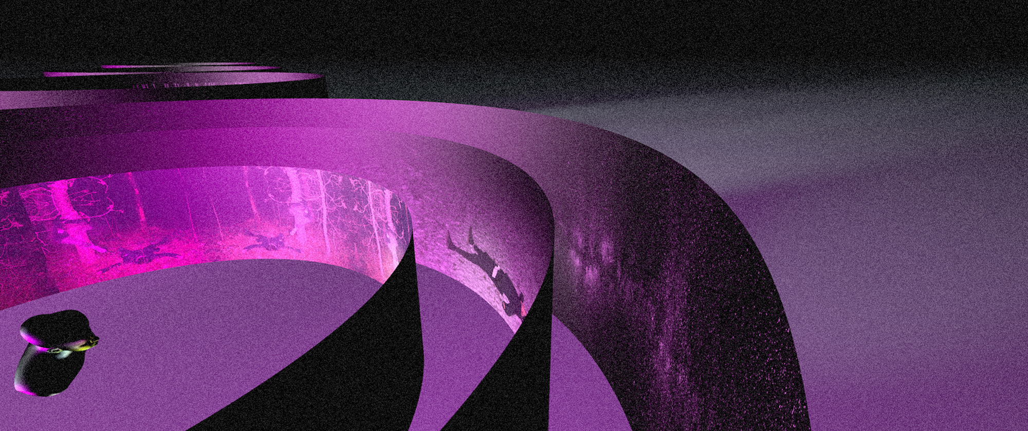
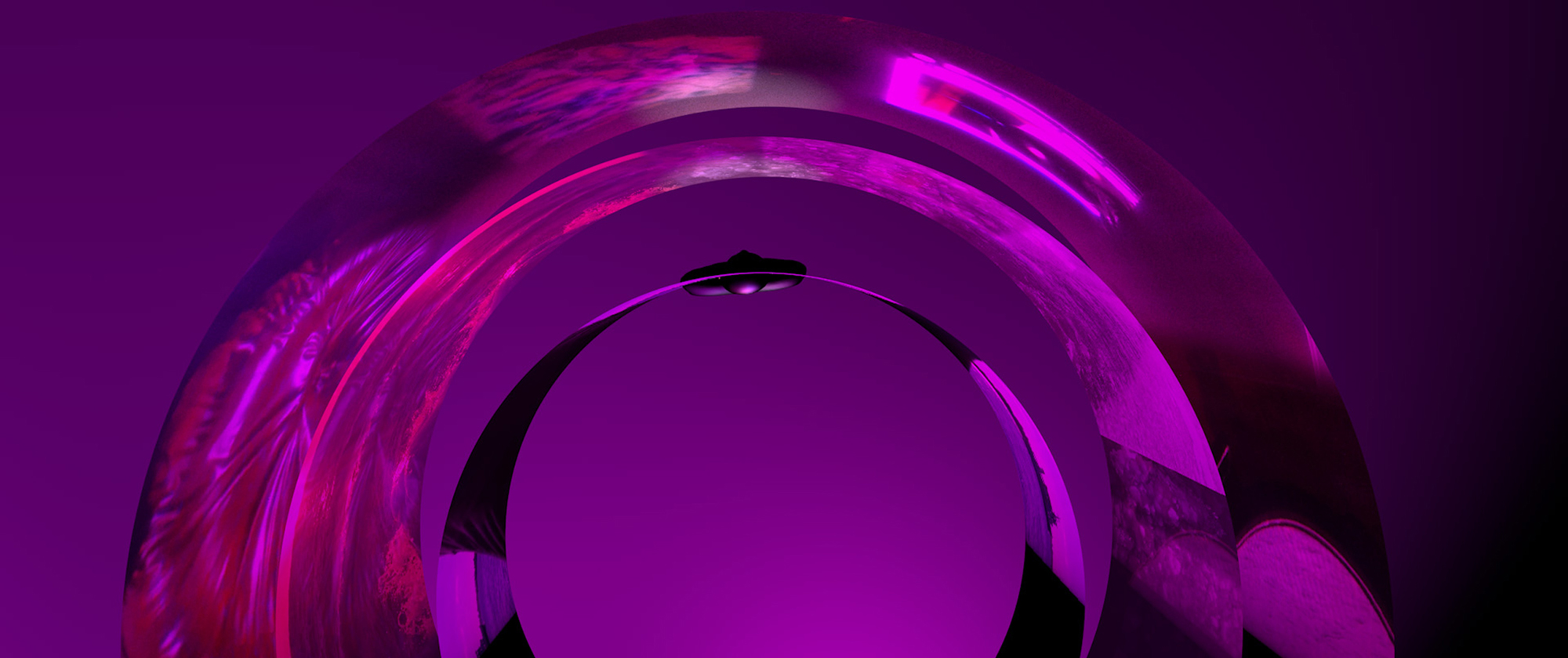
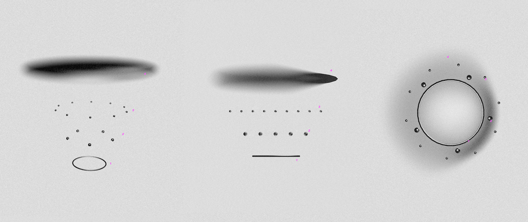
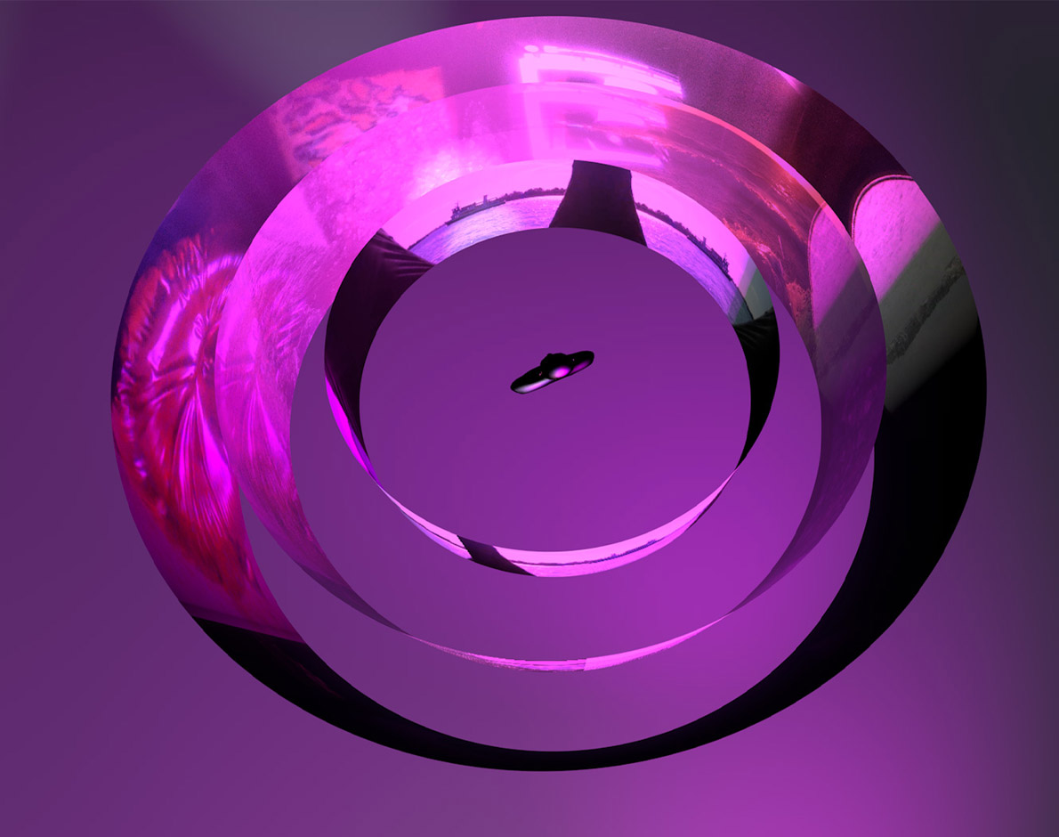
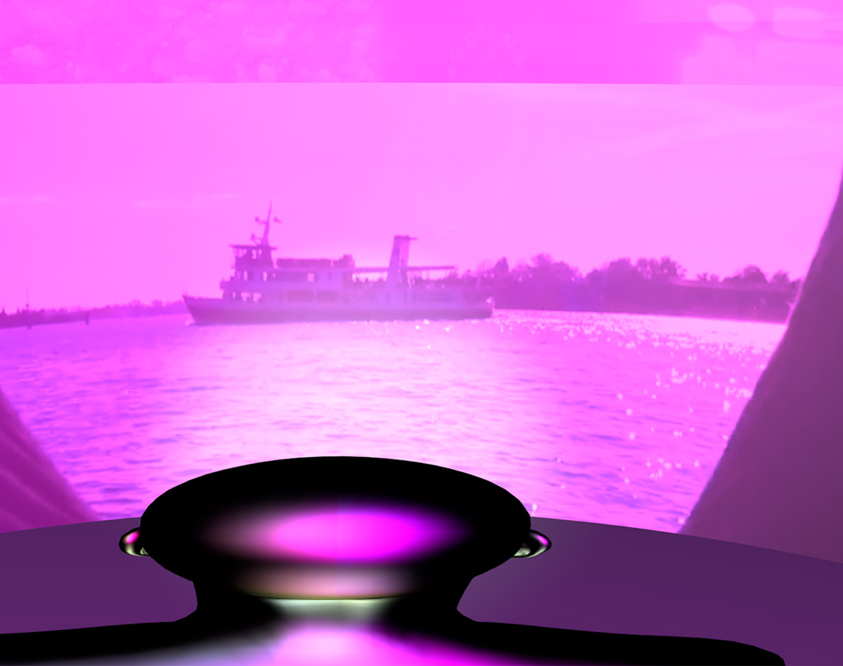
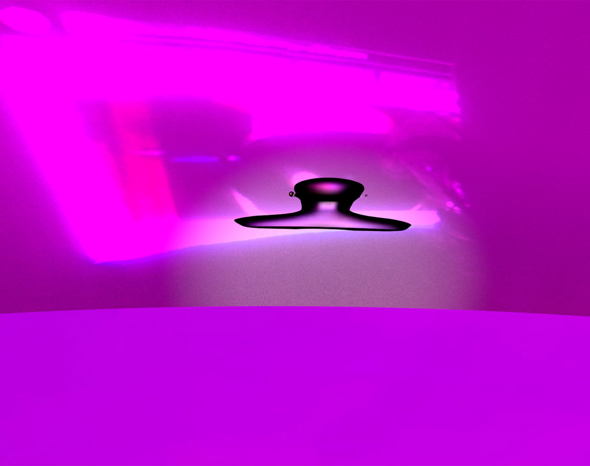
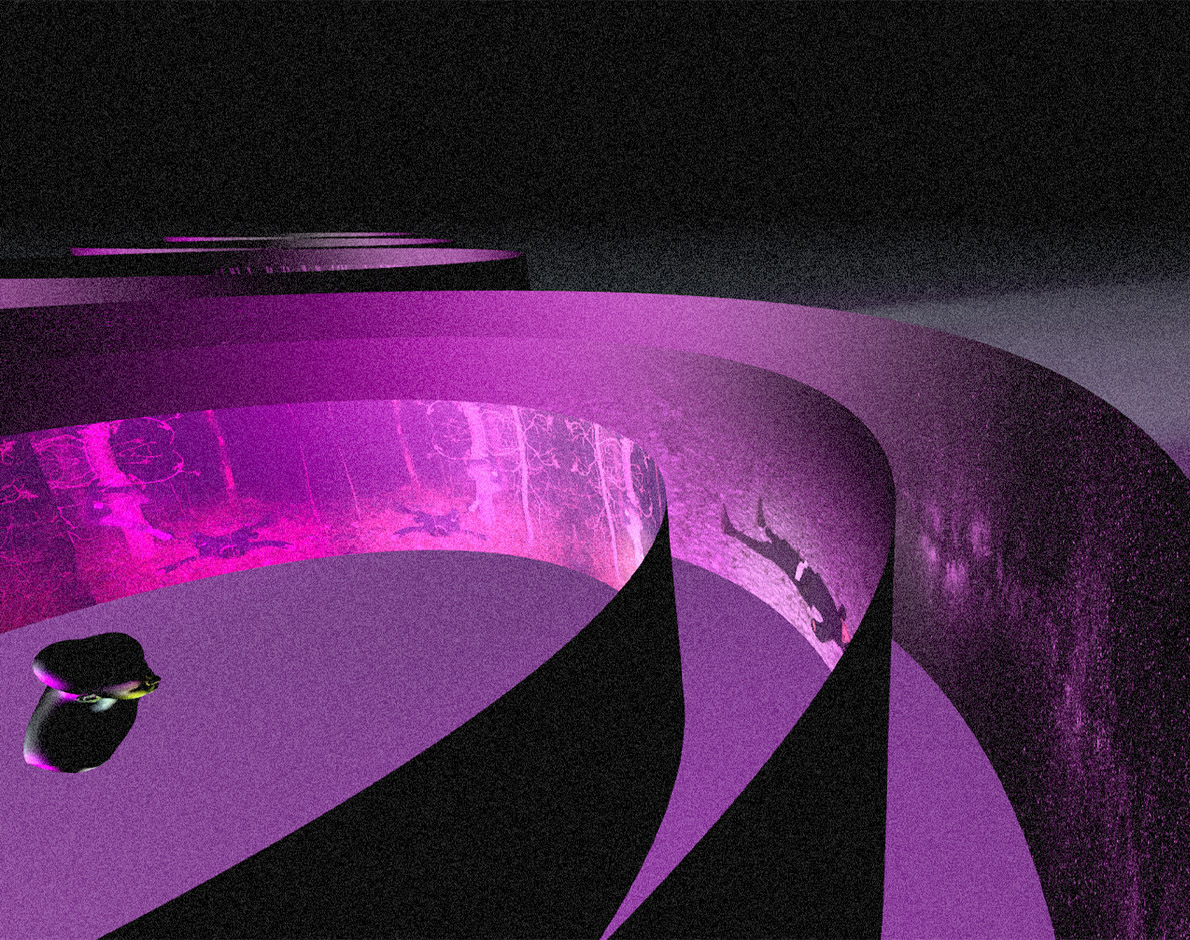
In this game players traverse through four distinct spheres, each representing different stages of memory and perception. Sphere 1 anchors you in a realistic, linear narrative, where five key associations subtly emerge, evoking a natural inclination to explore further. Sphere 2, these associations expand, creating narrative fluidity as new connections arise. Sphere 3 delves into the realm of metaphor, emotion, and fragmented language, gently guiding you toward Sphere 4—a space of timelessness and detachment, where conventional narrative dissolves into pure abstraction.
VIRTUAL NARRATIVES
In this game players traverse through four distinct spheres, each representing different stages of memory and perception. Sphere 1 anchors you in a realistic, linear narrative, where five key associations subtly emerge, evoking a natural inclination to explore further. Sphere 2, these associations expand, creating narrative fluidity as new connections arise. Sphere 3 delves into the realm of metaphor, emotion, and fragmented language, gently guiding you toward Sphere 4—a space of timelessness and detachment, where conventional narrative dissolves into pure abstraction.
Game
GAME DESIGN
Lift off
Visual Identity, Audiovisual Performance
ART DIRECTION
w/ dear Jonatan Kuna
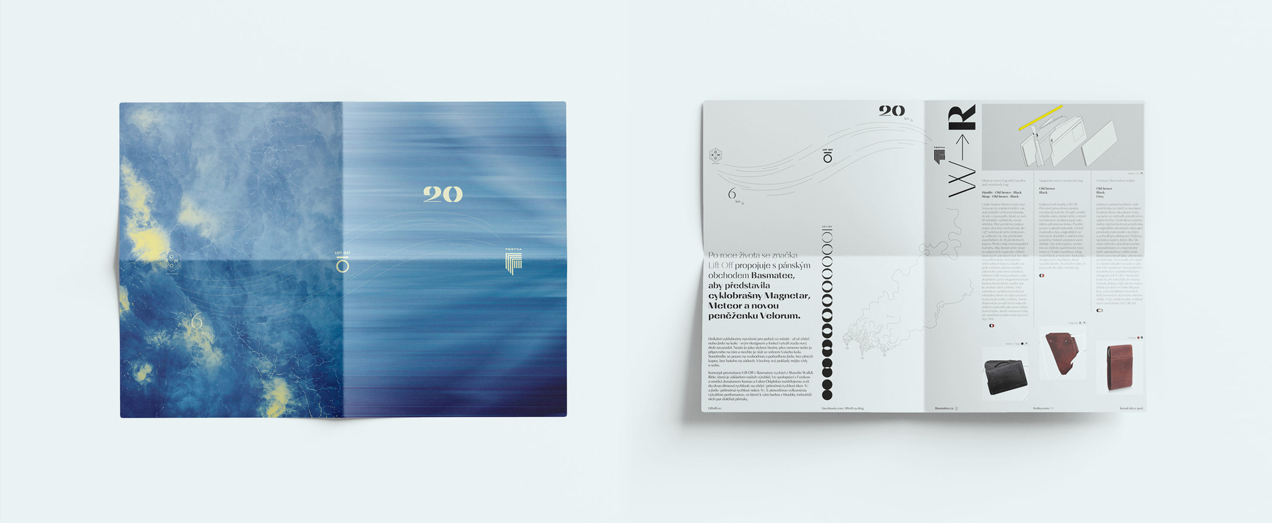
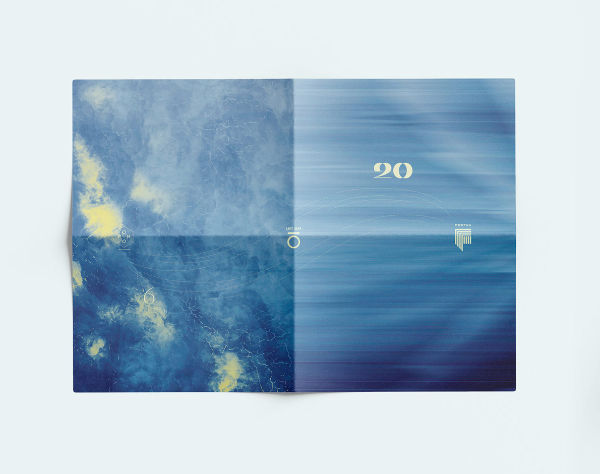
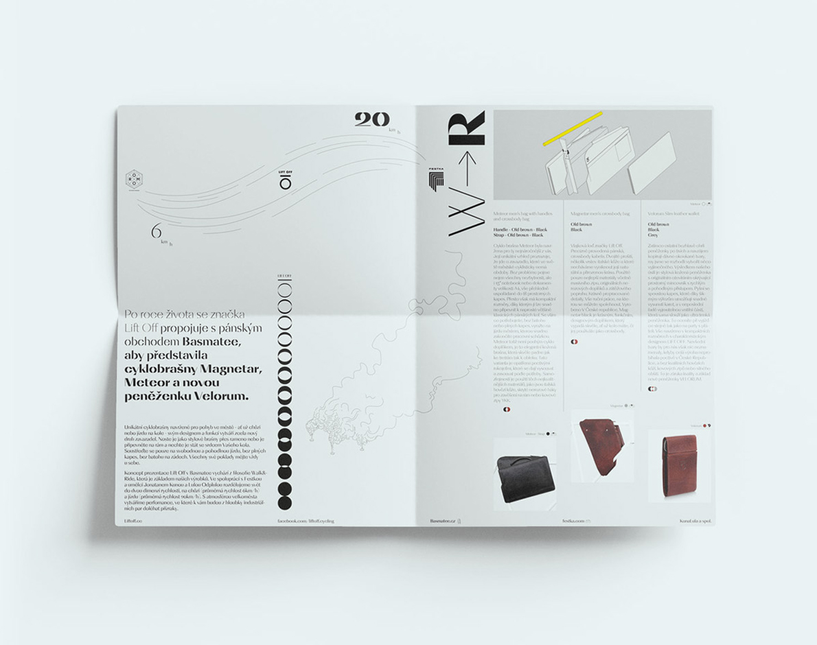
We created the visual identity for the Lift Off (Naut) brand popup in Basmatee which included an audiovisual performance. The brand presented fashionable products that could be adjusted as cycling gear. The products were introduced in the performance that took place in two shop windows. In one the performer was a pedestrian and in the other a cyclist. As the brand often uses the metaphor of traveling to space in its communication, we used projections to make the performers seem to soar to dizzying heights.
LIFT OFF
We created the visual identity for the Lift Off (Naut) brand popup in Basmatee which included an audiovisual performance. The brand presented fashionable products that could be adjusted as cycling gear. The products were introduced in the performance that took place in two shop windows. In one the performer was a pedestrian and in the other a cyclist. As the brand often uses the metaphor of traveling to space in its communication, we used projections to make the performers seem to soar to dizzying heights.
Visual Idenity Audiovisual performance
ART DIRECTION
w/ dear Jonatan Kuna
La Bibiche
Brand Identity
GRAPHIC DESIGN TYPOGRAPHY
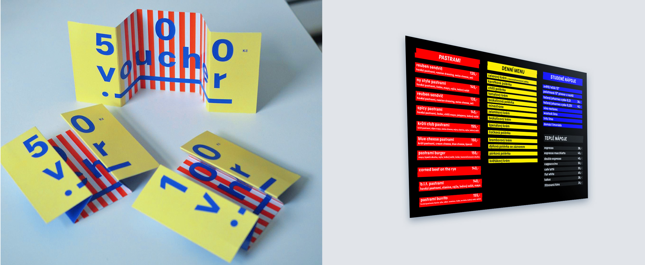
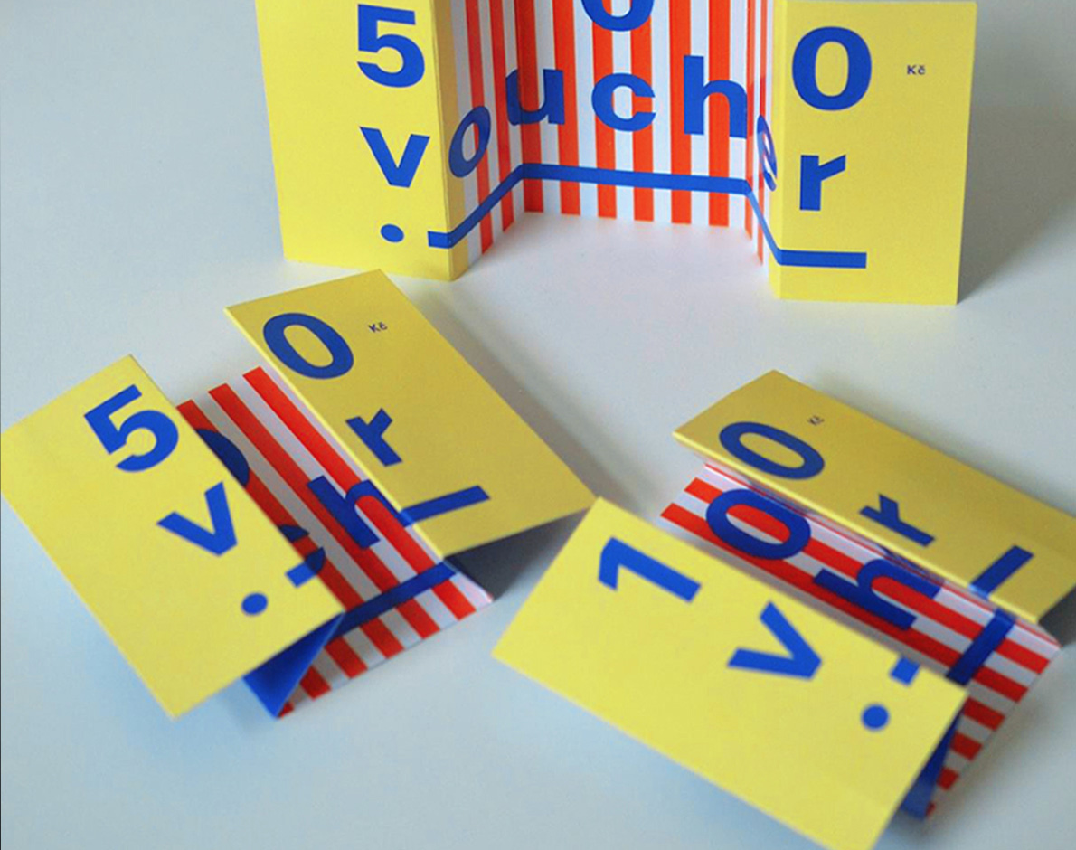
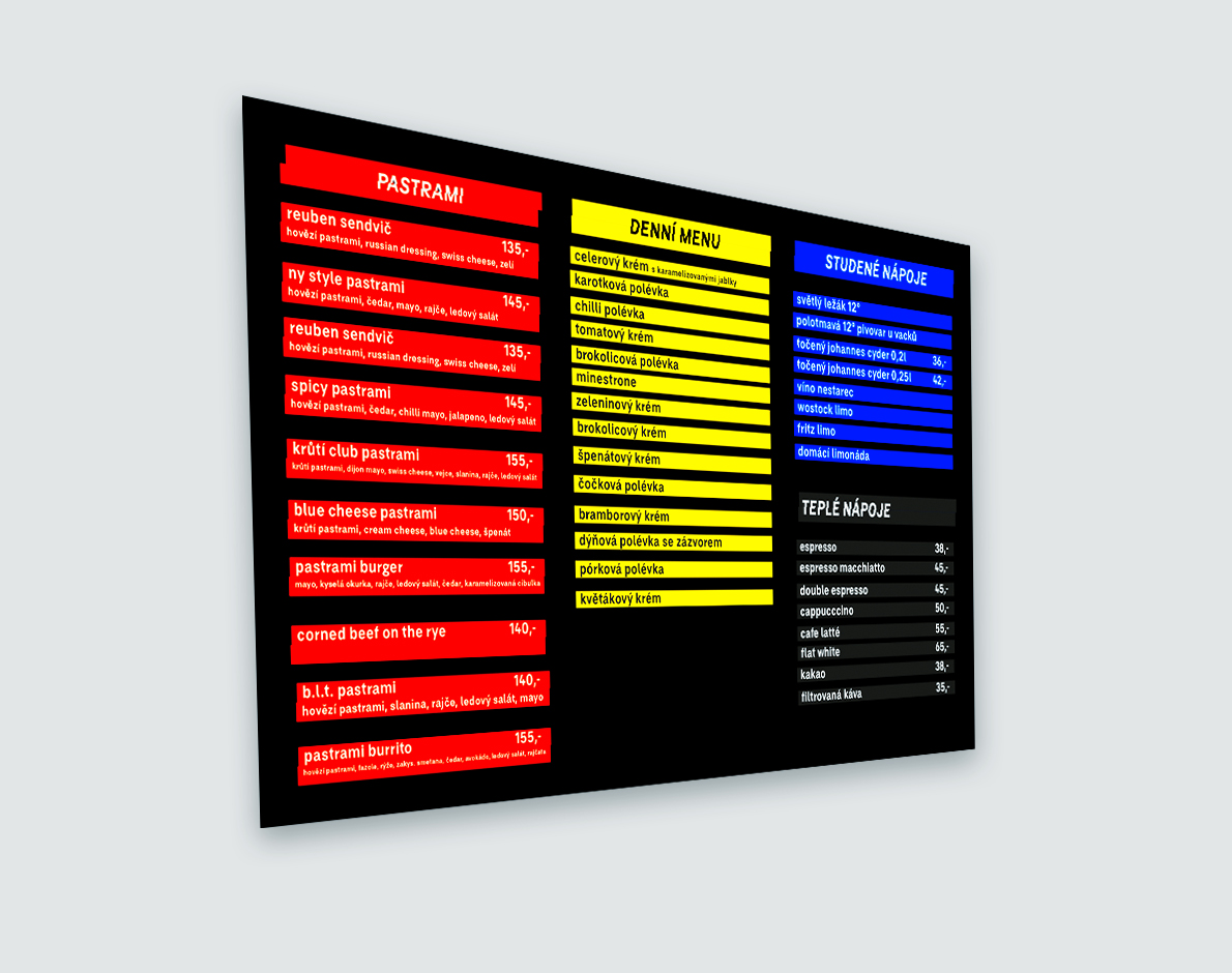
La bibiche is a bistro specialized in pastrami sandwiches. The custom typeface logo and the Visual Identity system are based on layering information, same as ingredients are layering in sandwiches.
LA BIBICHE
La bibiche is a bistro specialized in pastrami sandwiches. The custom typeface logo and the Visual Identity system are based on layering information, same as ingredients are layering in sandwiches.
Brand Identity
BRANDING TYPOGRAPHY
BIO
Lucie Zelmanová
DoB 02 07 1991
WORK
from 2021
BRAND IDENTITY MANAGER
Company: Kunsthalle Praha
2018—2021
ART DIRECTOR
Company: 6543 Digital Crew
Selected Clients: Russel Hobbs, Tesla Lighting, Prague Pride
2015—2018
UX, UI DESIGNER, GRAPHIC DESIGNER
Company: Brand New Prague
Selected Clients: Remington, Kluge, Metaxa
from 2013
SELF-EMPLOYED GRAPHIC DESIGNER
Selected Clients: Ešatna, Naut, Yo! Sissy
EDUCATION
UMPRUM: Academy of Arts, Architecture and Design in Prague
Fine Arts, MgA.
UMPRUM: Academy of Arts, Architecture and Design in Prague
Graphic Design and New Media, BcA.
VOŠG a SPŠG Hellichova
Photography
VOŠG a SPŠG Hellichova
Graphic Design
SKILLS
Creating visions and transforming them into reality